Throughout our soft opening and multiple playtest sessions, we received consistent feedback that while the core gameplay and narrative integration were smooth and well-received, there were recurring concerns about the UI layout and the UX experience it created—especially for first-time players.
Core Problem
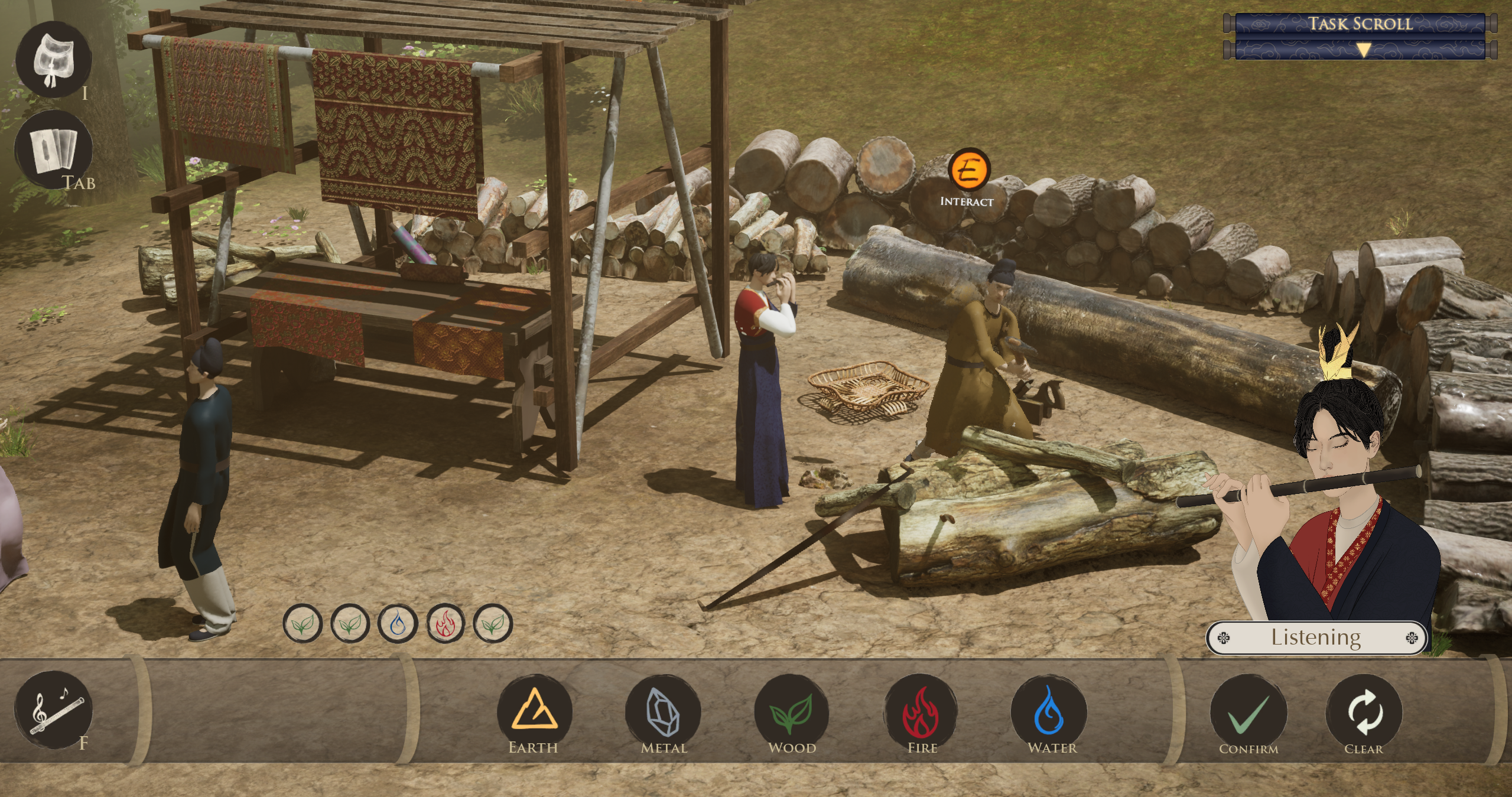
Our game’s UI presented mixed layout orientations and visual hierarchy issues:
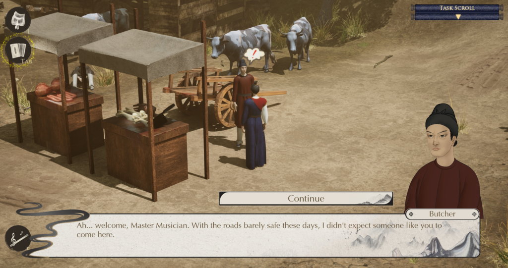
- The flute UI (essential for note playing) used a vertical layout on the left side of the screen.
- The dialogue box appeared horizontally at the bottom.
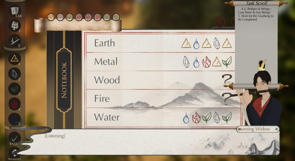
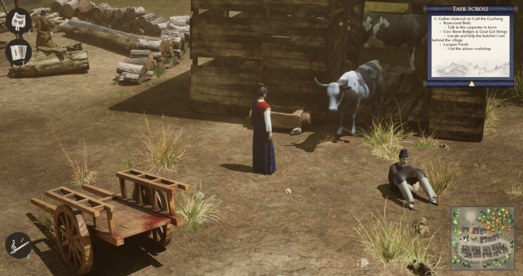
- The notebook UI opened across the middle in a wide horizontal layout.
This inconsistency between horizontal and vertical interfaces—combined with the constant need to glance between flute, dialogue, and notebook—led to a disjointed and confusing player experience, especially for new players unfamiliar with top-down exploration games. Some also struggled with navigation and spatial memory within the map.
Final Week Focus: UI/UX Polish
To make the biggest impact in the shortest time, we’ve prioritized streamlining the UI/UX layout, making it more intuitive, readable, and visually coherent.
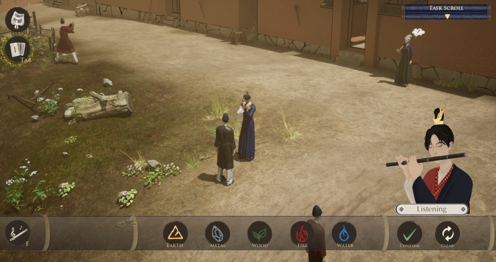
- Playing Flute UI – Make It a Prominent, Intuitive Feature
- Changed the flute layout from vertical to horizontal to align with the dialogue and notebook layout.
- Repositioned the flute icons to the lower portion of the screen, separating it visually from the notebook and inventory UI.
- Replaced the hotkey indicators (“1 2 3 4 5”) with the corresponding elemental note names (Earth, Wood, Fire, etc.) for better clarity and thematic consistency.
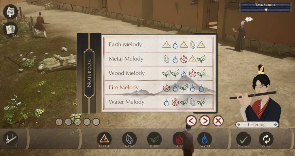
- Notebook UI – Reduce Clutter and Improve Readability
- Reduced the overall size of the notebook interface so it occupies less of the middle screen.
- Added a word-highlighting feature: when a player learns a new vocabulary word, the notebook automatically opens to the relevant page and highlights the new term in bold red for easy recognition.
- Task Scroll – Improve Visibility and Aesthetic Clarity
- Shortened the task scroll length for better readability.
- Replaced numeric task indicators with cleaner, stylized font icons to enhance visual clarity.
- Mini-Map – New Feature to Improve Navigation and Orientation
- Introduced a mini-map feature that displays the player’s current location within the environment.
- Designed to assist players unfamiliar with top-down exploration games, ensuring they can navigate the world confidently and never feel lost.
By improving clarity, layout consistency, and navigational support, we’ve significantly enhanced our final version of the game.