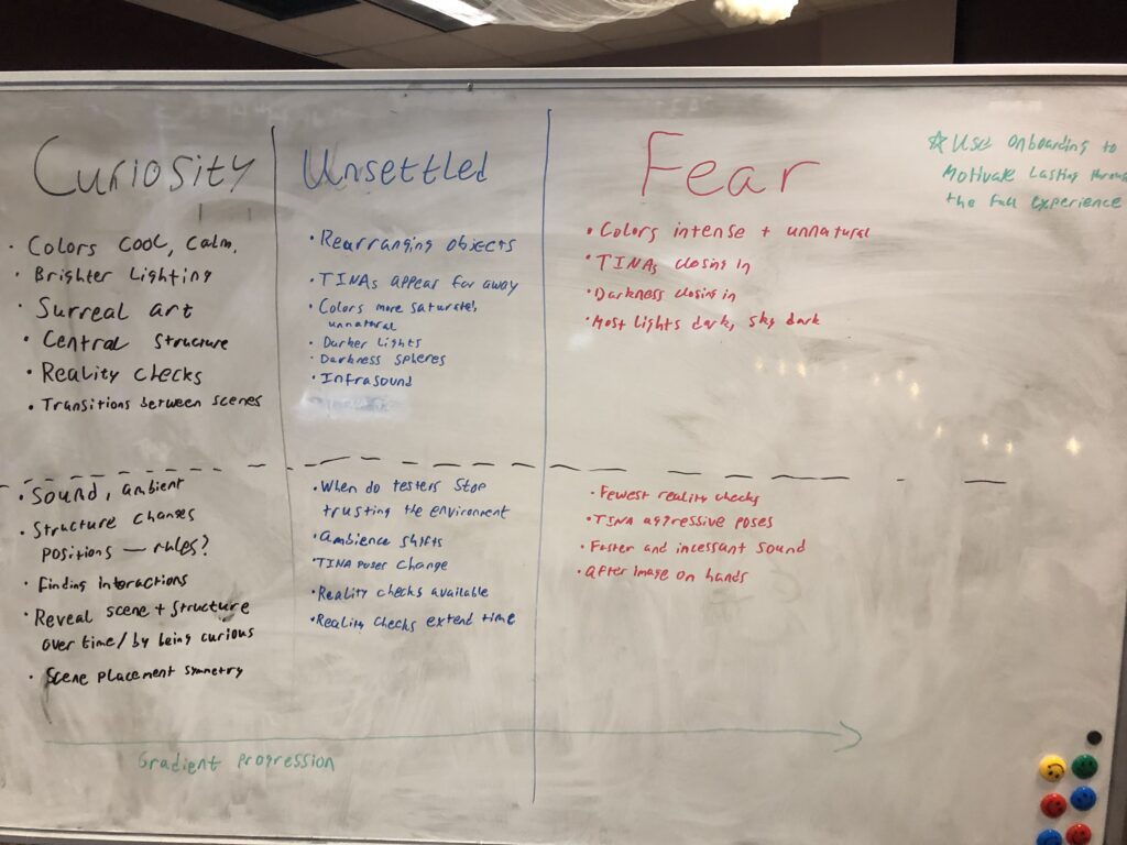
This week was all about making up lost time from our struggles the week prior, and the team really came together to make that happen! Making good on our plan from the Friday before, we started this week with a full team meeting in which we laid out all the aspects of our experience, and clarified anything that was ambiguous or unanswered. This resulted in a whiteboard diagram of the three phases of our experience—curiosity, unsettled, and fear—which laid out the specific visual effects and interactions that comprised each section. We also clearly decided that we wanted these effects to layer with each other and to progress on a gradient. This was different than our experience thus far, where the visual changes happened all at once after a certain amount of time had passed. Working from this whiteboard diagram also gave us a great starting point to make clear task and priority lists for each team member’s remaining work.
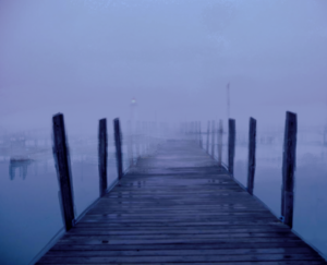
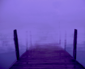
With our decisions and work tasks in place, we began developing the final two scenes of our experience—the lake and the cave—in parallel. Going back to our survey, these two environments came up often, and they represented two common but opposing fears—endlessness, visualized as an infinitely deep body of water, and claustrophobia, visualized as a cramped dark cave. Our artists and designers worked together to evoke these two feelings in their environments. The lake featured an endless expanse of water beneath a maze-like series of dock pieces, while the cave was composed of narrow tunnels featuring little light and numerous dead ends.


These new scenes also incorporated the gradual changes we had discussed, with visuals that changed slowly throughout the whole experience. These effects included the sky and fog colors in the lake as well as the crystals and lighting colors in the cave. The work we did on implementing these effects for the lake and the cave also allowed us to introduce similar features back into our two existing scenes. Now the sky, fog, textures, and lighting in the cemetery and parking lot could also shift gradually instead of all at once. This change in design made the visual effects less consciously noticeable, and instead contributed to a subconscious, slowly growing discomfort in players that was much more in line with our intended emotional arc.
Our team also continued to iterate on the effects that will hopefully create our oil paint art style, but we continued to run into difficulties. After much trial and error, we were able to position the render texture with our oil paint effect so that it perfectly filled the player’s vision while also not appearing too zoomed in or out of scale. However, it was at this point that a fatal flaw with our approach became more obvious—this technique completely removed the stereoscopic 3D effect that is central to VR’s feeling of depth and presence. Instead, our experience was now presented as though a giant flat screen was attached to the player’s head, which greatly lessened the sense of immersion for testers. Moving into next week we will either need to find a way to reproduce this same effect in 3D, or else come up with an entirely different way to evoke the style of an oil painting.
