4/1 – 4/6
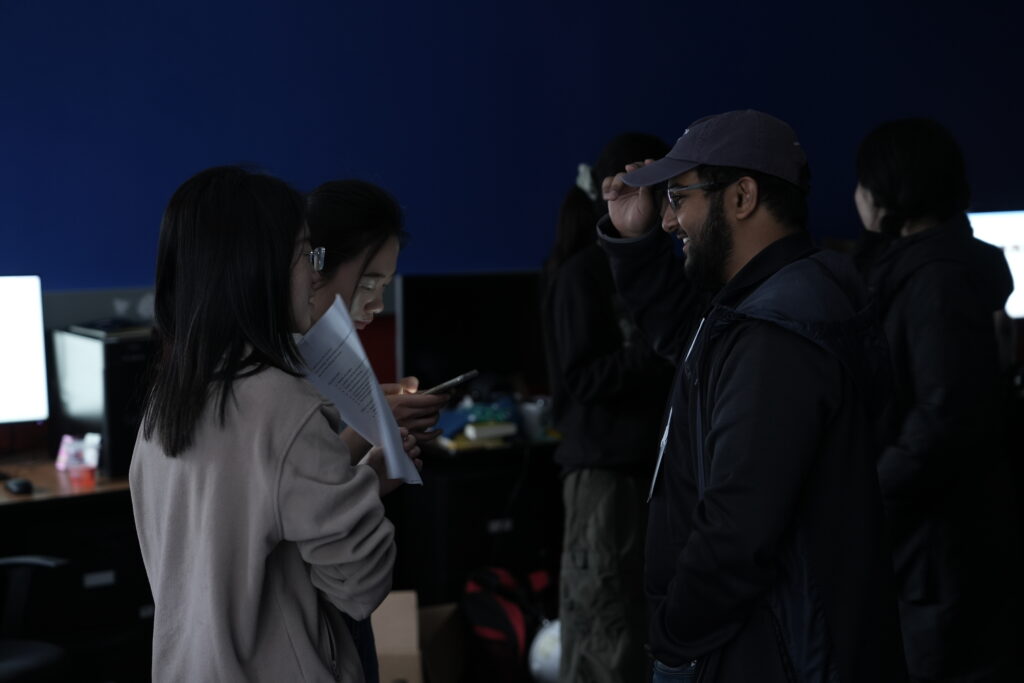
Playtest Day
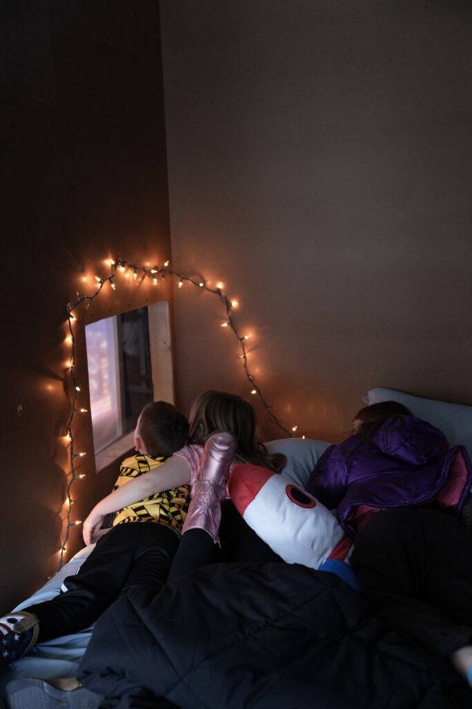
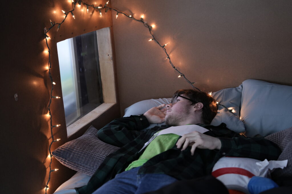
We got some very nice comments and feedback from our 15+ participants. We interviewed them after they experienced the window box. They said they felt melancholy, sad, and calm, and reminded them of nostalgia. One of our teenage year old participants even cried when he watched the video since it reminded his memories of parting with a friend. All these feelings were what we hoped we could bring to our users.
Also we found where we need to improve our product in the next couple of weeks. Here are some questions we wanted to think about:
How to make the interaction of the building/mountain more visible? Think about during a period of time, moving the foreground and only leaving the interactive elements on canvas?
Most participants said the experience made them feel calm with a bit sad, how to make them feel sadder?
Regarding the visual, how to make the countryside look sad and as good as the city view? How to make the transition between the two scenes?
Hardware and Illusions
This week, the wood and frames arrived. Angie and Cassie built up the wall and set up the bedroom corner in our project room. They plan to paint the walls to make the room more like the guests’ own bedroom.
UI/UX
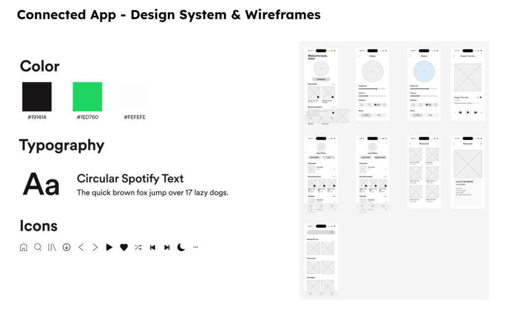
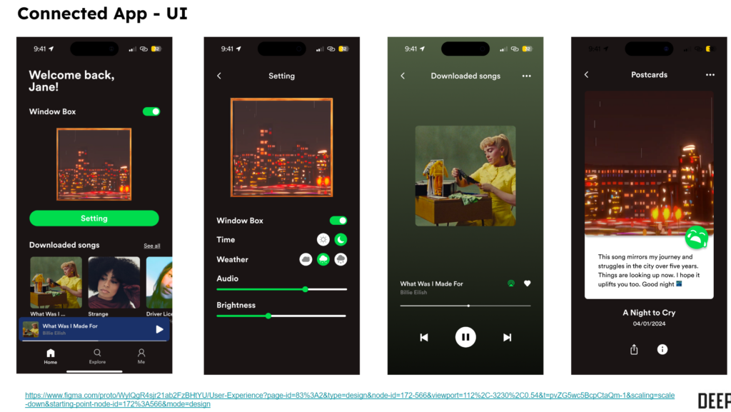
The 4 designers, Anna, Kira, Yawen, and Cassie, gathered together and discussed the information architecture made last week. We agreed that it should be more focused on the smart home aspect than the music streaming function. Based on the revised information architecture, Yawen and Cassie worked together to create the UI for the app. Cassie created the lo-fi wireframes to flesh out the UX and foundation for the layout. Yawen then finished up the prototypes by adding colors, adjusting some buttons and layouts on the screen, and adding some interaction to make the prototype feel more realistic.
Programming
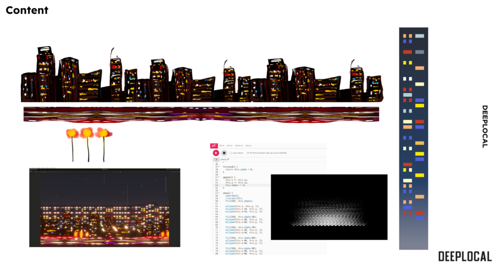
Using the contents drawn by Kira, Annie built a nighttime city scene in Unity. After she implemented the passing by effect, she used postprocessing and lighting to make a better visual effect of the city. She added primitives for the buildings Through the combination of lighting and elements in the scene, there is a more realistic feeling of the city with windows on buildings flashing and cars passing by fast. She also discussed with Anna and adjusted the buildings in the background that interact with the audio frequency. She discussed with other designers and balanced the lighting and movements of the scene elements.
Art
Kira drew a stylish night city view. The scene worked well with the window box.
Anna did the interactive building with Annie.
Conclusion
After the weekly meeting with Mo, we decided on our next steps. We would do the first draft of the script and storyboards for the final. We need to make progress on the content creation and the design documentation. The choreography is another thing we want to improve. We would like to create a consistent and interesting story through choreography. Also, we’d like to clean up the window to make it look nice and pretty.
