3/25 – 3/29
Story
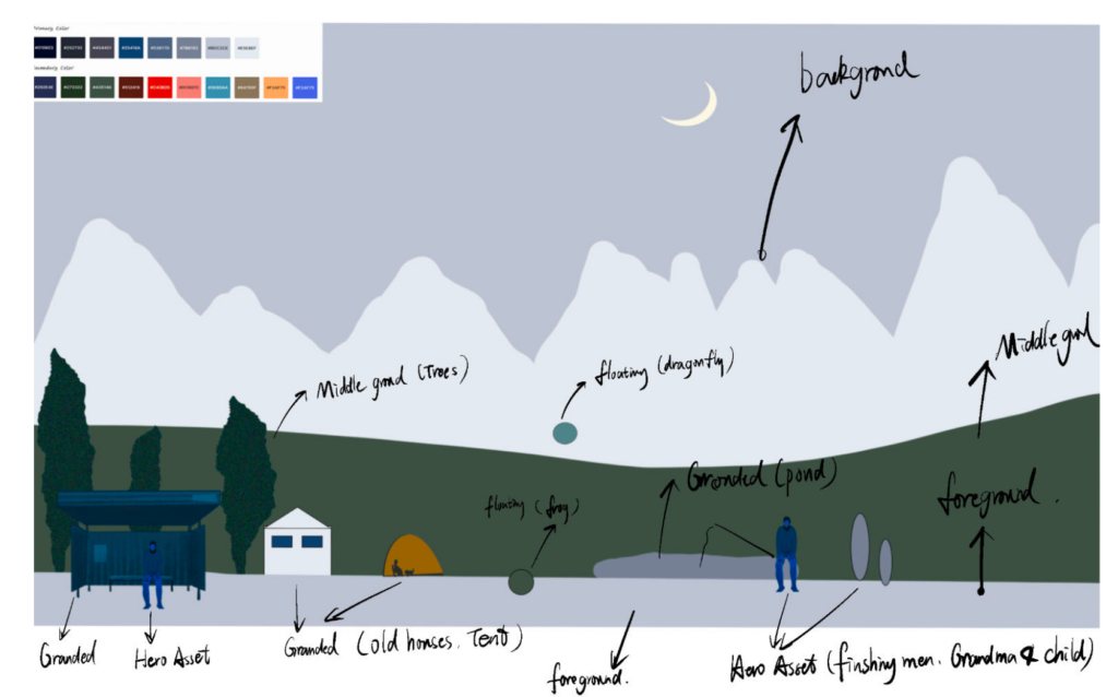
At the start of the week, Angie ran a meeting with the team to make sure everything was in order. We went over the one liner and made sure the decisions we made for the experience reinforced our one liner. We then had a conversation about nostalgia, as we liked the concept and how it could be reflected in our piece. We thought about our childhoods, and what we liked to look out of a car window, and we all together thought about the countryside. We liked the imagery that this gave us, open fields, sparse landscapes, and occasional cows, so we decided to gather around this kind of imagery for our final piece. We made an asset list of what we wanted, including “hero assets,” which are important, animated moments, and static assets, which pass more frequently. We also made several decisions on what we felt would emphasize the music of the song with how assets appear on screen.
Programming
As we were more sure about what direction we wanted to go for, we built a countryside scene in Unity. Annie brought the parallax effect, tempo matching, and audio frequency analysis into the scene. She organized different layers and manipulated their speeds and priorities in sorting layers. The first part of the scene was the mountains that have shapes changing in real time with the frequencies. She worked with Anna on this effect. All the elements in the scene move as they are passing by the viewer and they reappear infinitely, which is what we want. The other part of the scene is the grouping of elements. The scene is composed of layers of characters, such as a bus stop man and an animated frog, foreground such as ground, trees, and grassland, midground with interactive mountains, and background with houses, animated dragonflies, and cable cars. The third part of this scene is the cable cars that change size and color from the beats of the music. The first layer of cable cars changes twice as fast as the further layer of cable cars. The fourth layer of the scene is the sky made from shaders and the lighting of different layers.
Hardware and Illusions
This week, Angie and Cassie have iterated the concept art for the space from last week. With the concept art, Cassie has collected items from Amazon that we want to purchase to decorate the space. She has gotten approval from Mo and created an order list for ETC Support to purchase. Angie created a blueprint for the installation and approved it with Ruth, who said it should work fine. She then purchased the required hardware for the installation and will begin to assemble next week!
Art
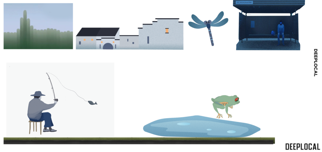
During this week, we had a meeting to discuss more details for the style guide. We decided which should be in the foreground, middle ground, and background, and which are hero assets, grounded assets, and floating assets. Kira was responsible for the style guide. Kira and Yawen worked on asset creation. Kira drew the hero assets, such as a fish man, a bus stop, and a man waiting for the bus. Yawen drew the floating asset, the dragonfly and the ground asset, the house, and the ponds. Anna made the interactive background mountains with Annie.
UX
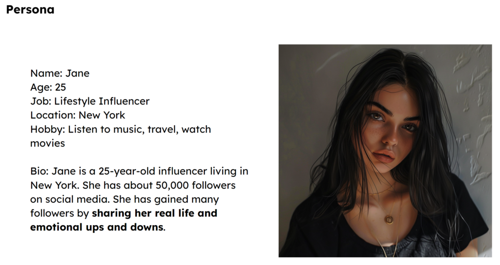
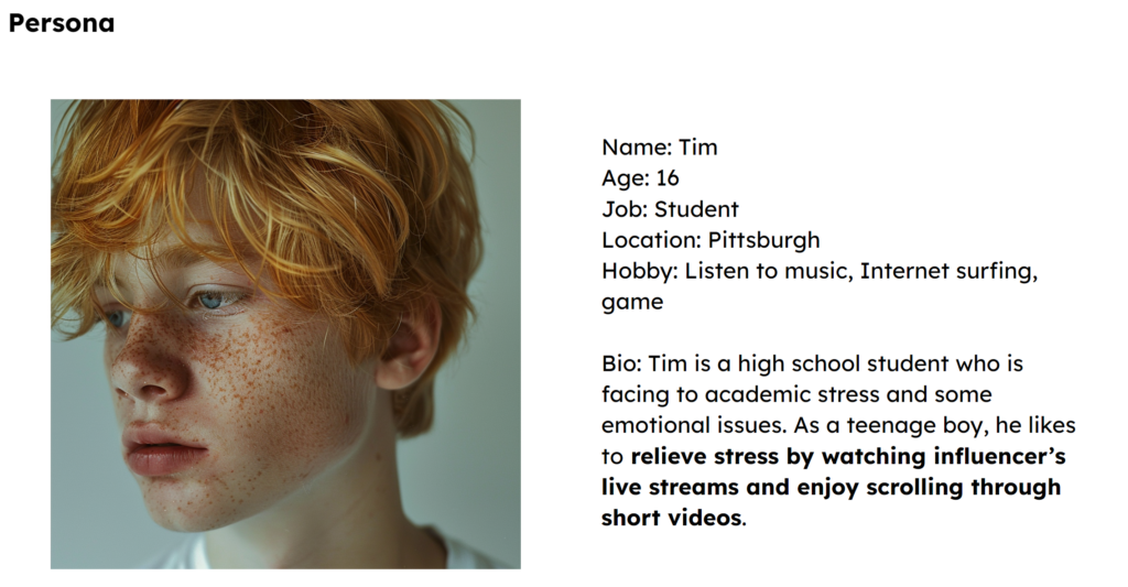
This week Yawen and Cassie developed the user flow which was used in the halves presentation because they want to create a more complete end-to-end user experience. Cassie reiterated the user flow by adding the start of the experience and how we want the experience to end. To present the user flow, Cassie and Yawen come up with a scenario of the entire process of the usage of this product. So Yawen has created 2 personas – one is our target user which is an influencer and the other is the audience which is a teenage boy.


Conclusion
This week’s progression and meeting with Deeplocal went so well! We got commend from our clients that they very much appreciate this week’s presentation format. We brought back our one-liner, added a recap, and told the story through what we did to connect every piece together. Jake liked the persona and the journey map a lot and he hoped we could bring back our two personas when we finished the product to see how the product is going to interact and make an impact on our two personas. Also when they saw the video of our art creation through the window box, they said it was very nice and everything started to make sense to them. They liked the illusion and blurry feeling created by the window. Since they feel the abstract interactive worked well, they wanted us to explore more about the abstractive art styles and we want to try the direction next week. Overall, we all feel things have become better and we know the exact direction we want to move!
