2/17 – 2/23
Hardware and Illusions
We received a bedframe and air mattress this week, so we put together a playtesting environment for our experience. Angie constructed a wall and window for the front of the TV so that we are able to playtest on the best without holding the lens in front of the screen. Together, we have a corner of the project room reserved for our playtesting environment.
Programming
Through researching, Annie found out that Unity would be a better platform for this project, and the team agreed. She used the audio frequency analysis to interact with the music. She made a demo which visually shows how the objects scale along the music frequency change. Then, she organized the png images that designers created into foreground, midground and background. She manipulated the speed for each layer for the parallax effect. The repeating elements are spawned when the frequency reaches a threshold. The elements are divided into groups. So, each group matches a spectrum of frequencies. Everytime a random element is selected from the group to be added into the scene. She asked each designer to pick a song for their scene. Then she adjusted the visualization of the scene, including speed, spawning threshold and grouping of elements manually for each scene. The scenes will transit by themselves, as a showcase of how scenes will change based on song switching.
Art


Designers in our team tried different styles of long scrolling digital paintings and showed to Deeplocal. These long scrolling paintings created a seamless feeling in Unity and we decided to move in this direction.
Based on the feedback we received from our client, we standardized how the objects/scenery outside of the window should move and tried to relate the elements in the scene to the music – appearing based on the frequency ranges. We each picked a song and divided the style into stylish and realistic – 2 work on 2 different styles for stylish and 2 work on 2 different for realistic.
Cassie was responsible for one of the realistic scenes. So she tried a collage with an illustrated beach background. She stylized the cutout objects, which relate to her sad memories, to lessen the distractions from the scene so that the audience could focus on their emotion and vibe with the music.
Yawen worked on stylish illustrations. She made a long-scrolling digital painting in Illustrator and added noise to the illustrations to add one more visual layer to it.
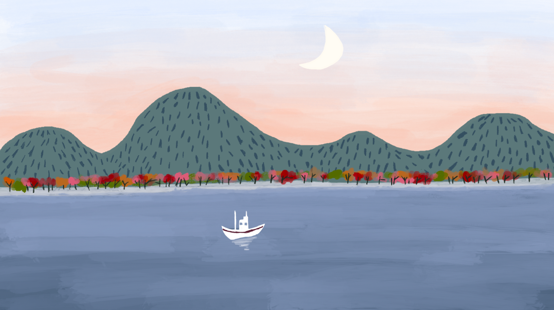
Anna worked on stylish illustrations and she drew rivers, mountains, and boats in procreate.
Kira worked on the realistic city view, she used the collage method to illustrate the scene.
Video Demo
Playtesting
We playtested our experience this week with both ETC students and middle schoolers that Anthony Palyszeski toured. We tested guests on two different aspects of the experience: the depth illusion and if it is a distraction to guests and testing the demo video we created last week. We asked guests what they thought about while looking out of the window, if there was anything they liked or disliked about the experience, and what they saw looking out the window. For the content, we asked guests what scenes they remembered, what visuals they liked, and what aspects they did not like. We got some interesting feedback for both tests.
For hardware, some guests liked the distortion of the window, as it made the experience more abstract and they were able to project on it more. Other guests felt motion sick while watching the content, which is something we will make sure to avoid moving forward, as we don’t want guests feeling uncomfortable. We had some middle schoolers who resonated heavily with the experience, enjoying getting to listen to their own music and watch the world pass by through the window.
For content, guests tended to like landscape imagery more than the abstract scenes or scenes with figures in them. This will help inform our direction moving forward.
Conclusion
The playtesting showed us our window box was helpful to getting the audience involved in the scenes and get into the mood. The hardware and the programming parts worked well. Regarding the art content, the client liked the city illustration more and we explored the reasons behind it. We thought it was because the city scene contained a lot of components to look at. But we decided to improve the color palette of the city scene to make it look sadder.
