Project Summary
This week we added UI elements to the game. We are also starting to split our current level 2 into two different levels since it’s too long. We also updated some sound effects.
Current Schedule
- Debug level 2
- Add more narrative components to level 2
- Finetune level 2 base on feedback
- Update UI elements
- Split level 2 into two different levels and add next week plan to add more elements in both levels
What went well
- Debug and finetune based on playtest
- Art UI element finished
- Updated sound effects and working on BGM
Issues for support
None
Art Update
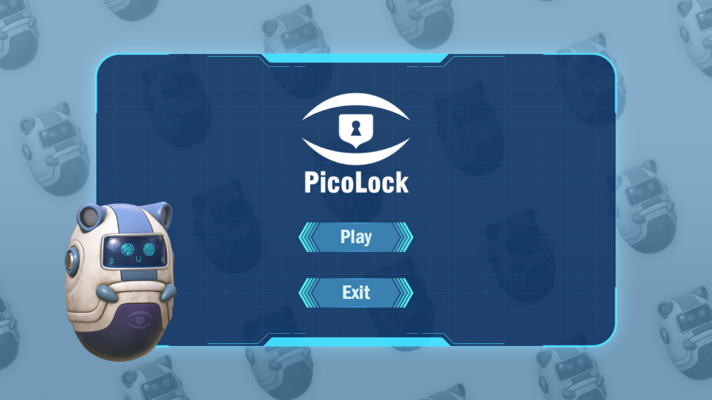
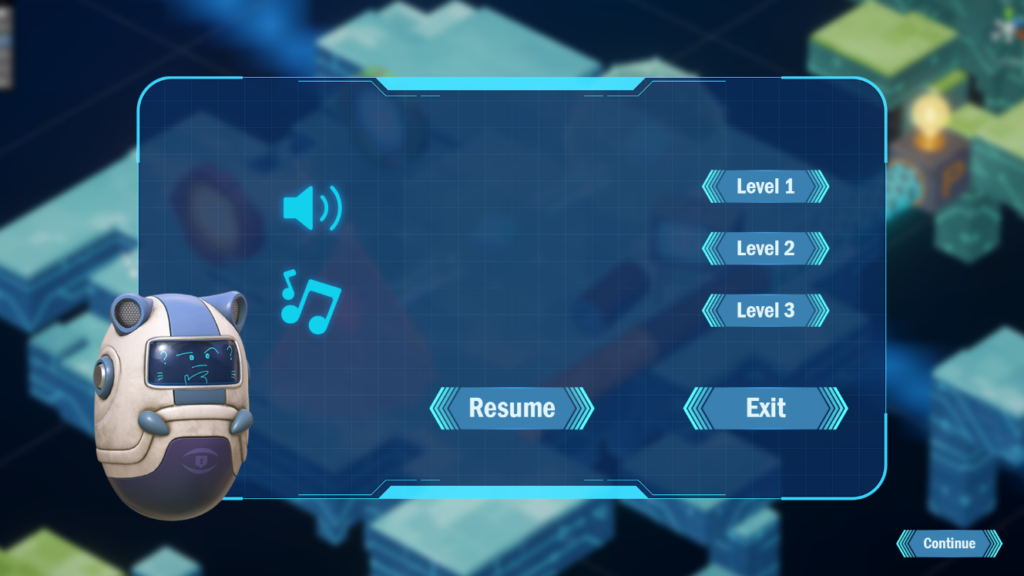
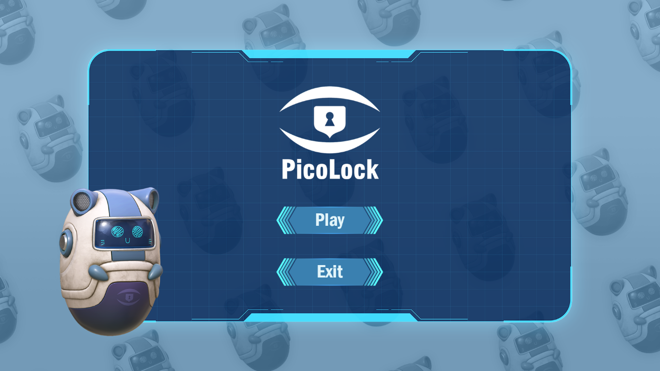
Below is the UI that is updated to the game. The color blue and white is chosen because it’s consistent with the robot’s color this is to make the scene more coherent. Player can choose to switch to another level in the pause scene.


Programming Update
We have started to split the level 2 of the game into two different levels. We made this decision based on the client feedback and observation of the playtest. We think this way the player will fell more rewarded after completing part of the level 2 because the current one is too long. Also we still need to think about the message we want the player to take away after playing the game and how we are ending the game. Splitting the game in 2 different levels allows us to finetune the first part and discuss the last part.
