ETC Spring 2024
Recollection is an ETC student pitch project for Spring 2024. Our goal was to create a VR narrative that depicts the emotions and experiences of a person with trauma, and by doing so, promotes emotional understanding of trauma in the Player.
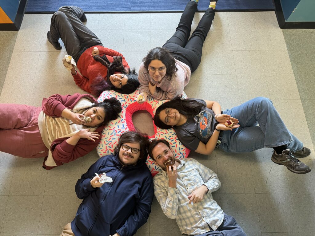
Our team consists of:
| Charlie Agriogianis – Technical Designer & Programmer | Vedantika Chaudhary – Producer & Sound Designer |
| Meghna Anil – 3D Environment Artist & Texture Artist | Steve Goehrig – Technical Artist & Producer |
| Kesha Bagadia – Game Designer & Programmer | Anna Salieva – Narrative Designer & Music Composer |
Story
The guest plays as Sam, a young painter dealing with the aftermath of a traumatic accident. After surviving a car crash that killed their mother, Sam struggles with their memories, emotions, and self-conception, trying to remember the memories they have repressed about their mother, themselves, and the people around them. Many of their memories have been tainted by their trauma, and intrusions of the accident derail their journey. They must uncover the memories they have repressed in order to come to terms with what happened to them.
Journey from Direct to Abstract
The majority of the first half of the semester was spent ironing out the design direction we wanted to take for this project. We wanted to approach the topic of trauma not as a factual demonstration but as a phenomenological one, that emphasizes the emotions of the character. That design goal took us from a linear, concrete narrative experience to one of symbolism, that doesn’t seek to convey the facts but rather invoke emotion in the guest. We needed to strike an informational balance between enough so that the guest doesn’t feel lost, but not too much that would distract them from the emotional impact of certain scenes.
Stirring All the Pots
Aside from the complex design goals and experimental choices, we had made our jobs quite a lot more difficult in every other aspect of production. We decided to go with a novel VR mechanic, painting, in order to connect the player to the character’s experiences, but in doing so created a technical challenge that took weeks to solve. Add that to a visual style that requires a watercolor shader, and our programmer Charlie was swamped for the first half of the semester ironing out those two features.
The 3D artists had a different challenge, to create complex models and animation assets that can clearly depict a car crash. In order for the scene to be impactful, modeling, animation, textures and sound design had to all come together into a cohesive scene.
We were also iterating over the mechanics, in order to figure out how we can bring the Player into Sam’s state of mind and highlight Sam’s emotions. In the end, we decided to go with a simpler design that relies on audio feedback, environmental storytelling and our central painting mechanic.
A build with all of these features only came together right before Playtest Day. Fortunately, once we had the build, the systems we had implemented and the mechanics we had settled on were easy to iterate on, and our production went up exponentially, with a new iteration of the build, with significant changes to the experience, coming out every week up to finals.
Lessons and Takeaways
Throughout the process, we came away with several takeaways we can use to inform our future projects.
Playtest Early by Using Other Mediums
Our ability to playtest with a Twine demo and a brown box version of our game helped us iron out our design vision and figure out which mechanics best served our experience goals. We were able to effectively leverage these different prototypes in order to understand the affordances and limitations of the medium. For Twine, we used a mix of storyboards and text to communicate the narrative and test the Players’ emotional reactions. The brownbox was an internal playtest we did very early in the semester in order to determine how we wanted to Player to interact with the VR space and create a cohesive vision for the game we were all aware of.
Serious Topic Doesn’t Mean Be Cautious
While it is important to be aware of the pitfalls media struggles with when depicting mental illness and trauma and to tackle the subject with respect and accurate research, that doesn’t mean we shouldn’t take risks. Many projects, because they are afraid of making mistakes, will deliver something that hardly reaches its full potential. We were encouraged early on by our instructors to lean into abstraction and experimentation, and it paid off. The experience became much more focused on depicting Sam’s emotions rather than delivering an ordered narrative, and our experimentation with the mechanics, level design, and art style gave us an understanding of what worked and what didn’t, and through this process we found the gold that made our project stand out.
Player Emotion as Guiding Principle
In order to measure the success of our game, we decided on a central guiding measurement: is the Player feeling what we want them to feel? This helped us understand what was the most important aspect of our game that all the pieces, tech, mechanics, art, and narrative, needed to strive toward. This also made it easy to understand when the playtests were successful and when they were not.
Technical Foundations Matter
One of the reasons why it was so easy for us to iterate and produce content at an exponential pace after Playtest Day was the technical foundations the system was built on. The shaders Charlie had created were designed to incorporate different underlying texture maps making it easy for us to swap out textures and colors of the environment, and easily incorporate it into the 3D art pipeline.
The memory-based, modular design of the interactions, coupled with a memory sequencer script made it easy for us to implement and swap out audio, interactable objects, environment lighting, and other assets in Unity.
The VR environment was a great foundation for incorporating all of these systems. And the narrative we settled on made it easy to write a script and create dialogue assets for the game at a fast pace.
Strong foundations with iteration in mind made our jobs easier later on in the process.
What Went Well (and Didn’t)
Our understanding of iterative development and our drive for experimentation made this project stand out and deliver a successful experience. We were never too attached to a certain idea and were ready to change things if they didn’t work out.
We all had different ideas on what experience we were working towards, which created a lot of conflict when a design deliverable didn’t match the vision of other members of the team. We spent long meetings early on trying to figure out what we wanted to make, which made us understand the content of the game, but not how it was going to be structured or presented. We knew Sam was a painter, we knew there was going to be a car crash, and we knew what memories we wanted to present. The design, however, was different, depending on which designer you asked. It was only close to Playtest Day that we were able to properly communicate and visualize a cohesive design for the game.
It’s important for the designers to properly communicate their thought processes and their vision. Without that ability, no amount of communication by the producer will fix the issue.
In the end, the principles of iterative design and our commitment to the final product helped us push through the difficulties and resolve any design conflicts we had. Our team worked well together, and that was what mattered in the end.

