After presenting our overall direction at Quarter, Week 4 focused on turning feedback into more concrete design decisions. On the design side, we explored how the arena itself could encourage movement and elemental strategy. At the same time, the art team began defining a unified visual direction for the characters, physical pucks, and the world of SpellChemists.
Design: Arena Map
This week we decided to move all constructed spells to pre-existing map terrain. This adds an environmental factor for players to strategize with that is also visible for opponents. These environmental elements set up (magma cliff, water fall, vine wall) are presets that alternate randomly, that can be hazards or buffs for players depending on spell repertoire or positioning. This not only add more randomness to the game play but also encourage players to actively move and reposition.
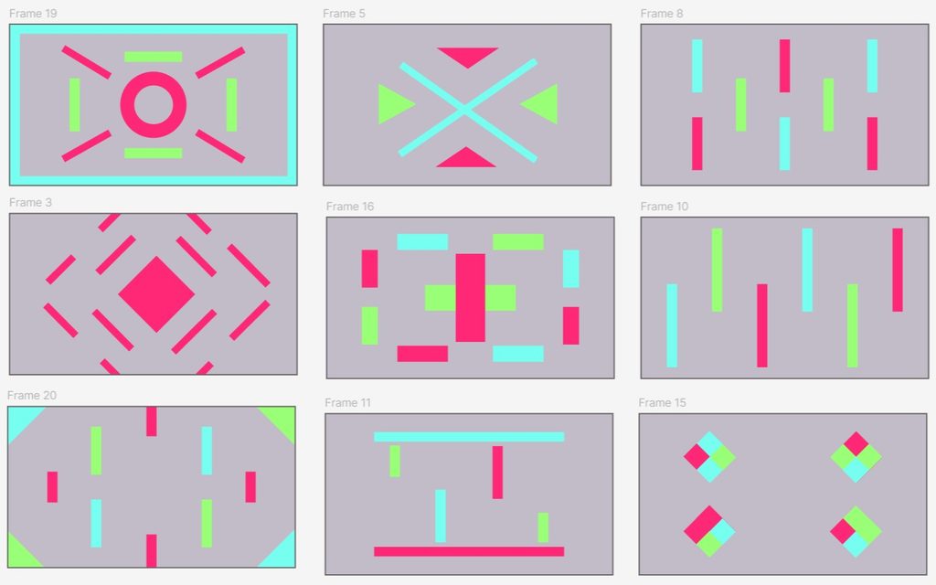
Our first map concepts explored three general archetypes:
- Crossfire, with elemental features arranged in offset lines or layers.
- Islands, with concentrated elemental clusters separated by open space.
- Corridors, with powerful multi-element chains placed along narrow lanes or diagonals.
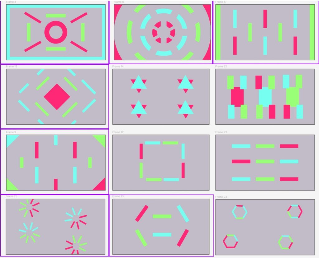
After some playtests, we picked some designs that encourage more player strategy, to prevent cases where the player hides in a non-elemental corner, we try to design maps where elemental puddle distributions divide the spaces evenly and block the edges and corners.
Art: Establishing a Shared Visual Direction
This week we focused on establishing our overall art style, puck designs, and character direction, while also beginning the Swift character model. Our visual style is designed to fit our target audience, taking inspiration from Dungeons & Dragons and Pathfinder while simplifying and stylizing the visual language to make it more approachable and readable. Since our game makes use of the Board as an important part of the player experience, we also wanted the physical spell-casting pucks to feel more intentional and fun to interact with.
Puck Design
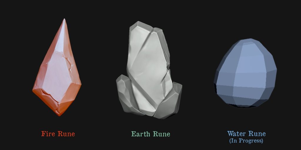
The three elemental pucks are designed as rune stones, with their shapes inspired by the characteristics of each element. The Fire Rune uses a flame-like triangular/diamond shape, the Earth Rune is a sturdy, organic block of stone, and the Water Rune has a smooth, rounded shape inspired by a water droplet. (Modeled in ZBrush)
Character Design
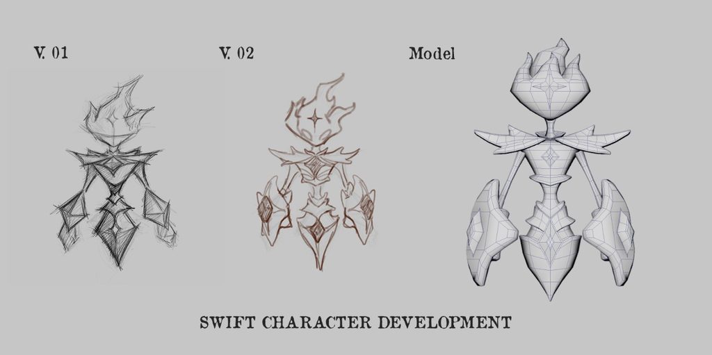
We also developed the visual direction for our two characters, Swift and Tank. As their names suggest, Swift has a lighter, slimmer silhouette, while Tank has a broader and heavier build. Alongside the character design drafts, we started modeling Swift and are beginning to translate the simplified 2D designs into 3D. (Modeled in Maya)
Looking Ahead
Week 4 brought the physical and digital sides of SpellChemists closer together. The arena maps give elemental strategy a visible place in the environment, while the rune pucks and character models give players more tangible ways to interact with that system. Moving forward, we will continue testing whether these visual and environmental choices remain clear during play and whether they encourage the movement, adaptation, and physical interaction at the center of our game.