A CLEARER VISION
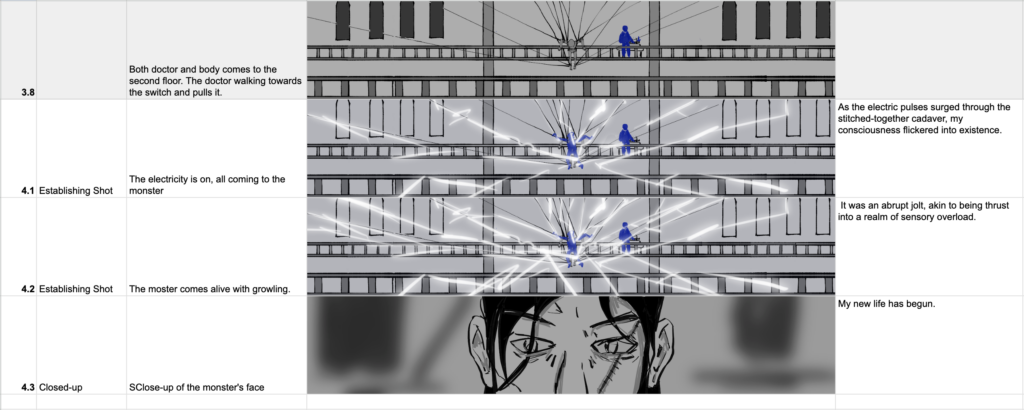
Advancing a project isn’t just about merging elements; it’s also about reflecting on what’s lacking. In our case, while we’ve got plenty of environment assets and textures ready to roll, there’s a big question mark hanging over the storyline. This often happens when everyone’s buzzing with excitement about the visuals and puts off thinking about the plot until later. But here’s the thing: whether you’re a storyboarder or part of the team, it’s crucial to sit down and hash out exactly what the audience is going to see. We’re talking about the nitty-gritty details of objects and motion here.
Rather than diving headfirst into asset creation only to realize something’s amiss later on, it’s crucial to elevate our storyboard to a more refined level. This approach ensures that the entire team shares a clearer vision, allowing us to invest our time and effort wisely in endeavors with a high probability of success.
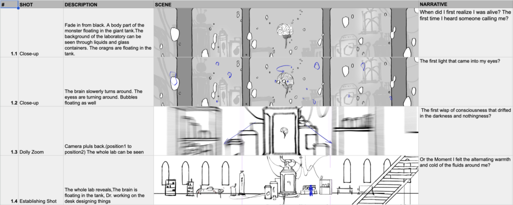
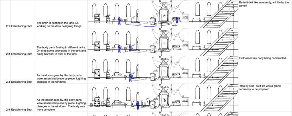
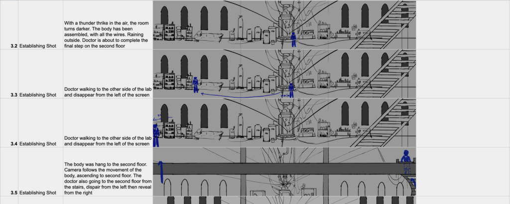
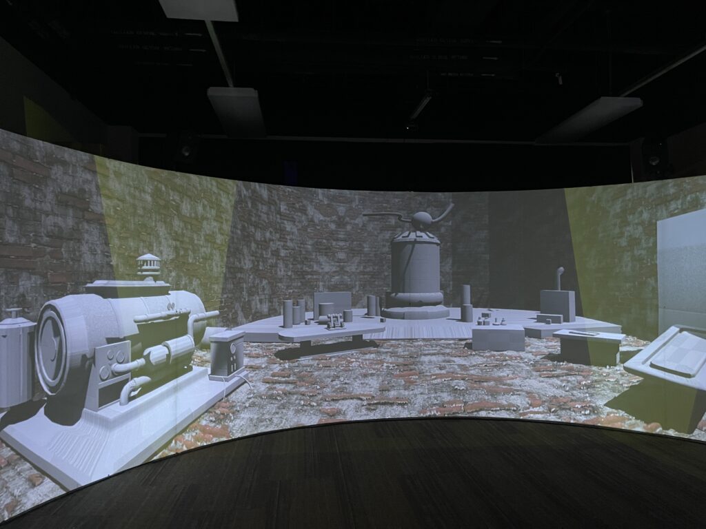
The exciting news is that the hardware within the Cavern has undergone an upgrade, allowing us to showcase content in higher resolution. Additionally, we’ve conducted tests on both our greybox and textures to gauge the overall ambiance. However, a significant issue has emerged: when combining elements within the standard ratios inside the box, we encounter stretching at the corners. Moreover, the curved screen complicates distance perception, necessitating further consideration of layout designs. In the following weeks, we will keep testing out different layouts in Cavern.
