
Last week, with our game design document, we started building out the functional and structural game, where exploration space and narrative + mechanical choke points (where players need to retrieve a certain information or item before they can progress) is set. A scene that can access the sky and the earth magnet in the spaceship (also posing as a tutorial level) is rendered with Naiad, our main character looking towards the sea. After the sky puzzle is solved, the camera perspective changed, and now players see Naiad under the tree. We also created the intro video onboarding players to the world setting.
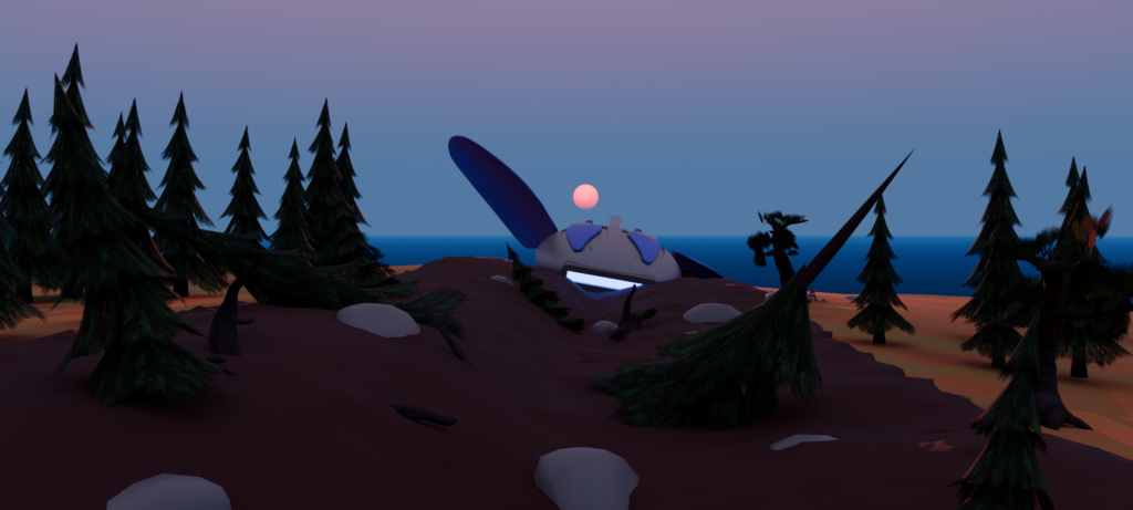
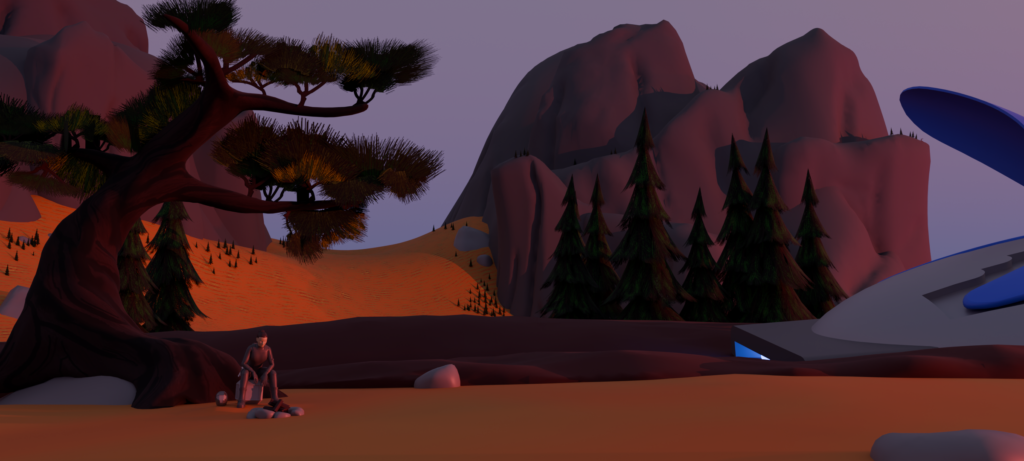
Game Design
A/B Testing the navigation
Now, off to granular game design. First, the navigation system we ideated last week. We have fleshed out two version of the navigation, one focusing on connecting as the base mechanic to explore the space and rotation as a additional layer to transform the space (to another scene), while the other uses rotation to navigate and connection to extend visual frames, and our goal this week is to A/B test them to see which one we would commit as the final navigation mechanic.
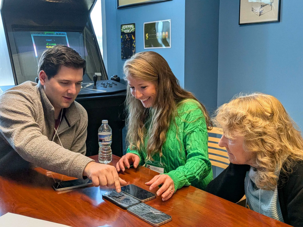
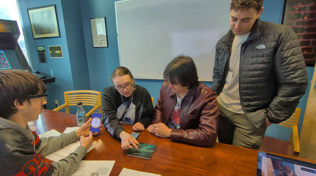
On Tuesday, we did the official playtest for the two version. Because the two tests are performed back to back, we tried to mitigate the bias from learning one system first and the other second by swapping the order of the administration of the two.
What we learned was: the rotation was extremely easy to learn (especially for those with game experiences), and multiplayer play was innately facilitated with the fact that each phone has a control / feature. Most importantly, it felt free! However, it prompted a heavy question of why exactly we wanted to use this on the phone?
The other version was much more difficult to navigate, yet people were clearly intrigued by this design, thinking that it’s innovative. In fact, too innovative that playtesters raised the question of why we are intentionally moving away from what phones are actually good at (such as tap). What we also realized was that, the order of the prototype being played matter. If they learned the rigid connections first, the free roaming nature of the rotation navigation felt refreshing, while if they were given the rotation first and forced to do only connection in a different scene, it was too restricting.
With one of the project goals being we want to be innovative and yet still learnable, we decided that it’s actually a balance of these two that we wanted. In the end, we made a huge decision: in addition to deciding to focus on connection first so it’s innovative and the rotation feels “fresh”, we are also bringing back “tapping” the screen, so that pinch is not the only interaction that touches the screen, and that will introduce the natural phone as a touch screen interaction to navigate to a place.
Actual puzzle design
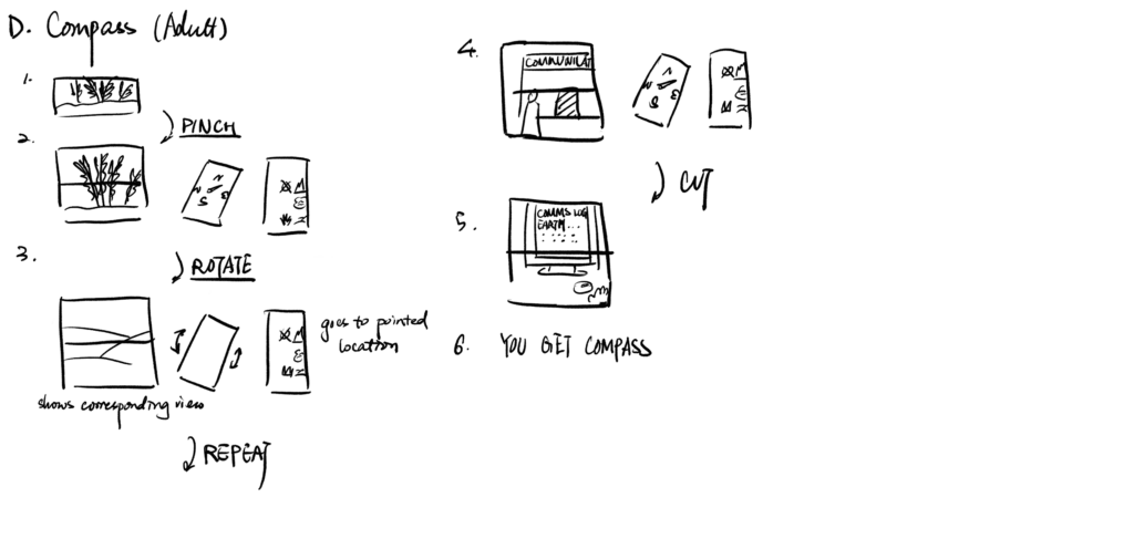
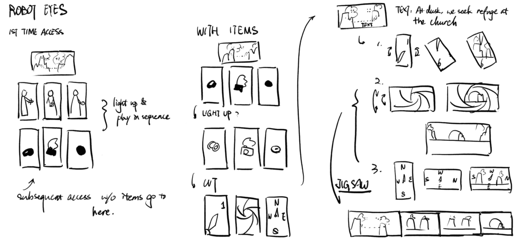
Building on that, we were able to further create individual puzzles on the assumption of players have learned connection and rotation in a certain way, and so for each of the puzzles, from concept storyboarding to fully functional build with some placeholder or unfinished assets were built out and integrated to the full experience.
Meaningfully, the three significant items that had to be combined in order to progress pass a robot eyes puzzle, were decided to be: a watch, a compass, and a camera, equivalenting the time, the place / where, and the moment of stillness / a photograph that all answers the main narrative question of where am I for the main character Naiad.
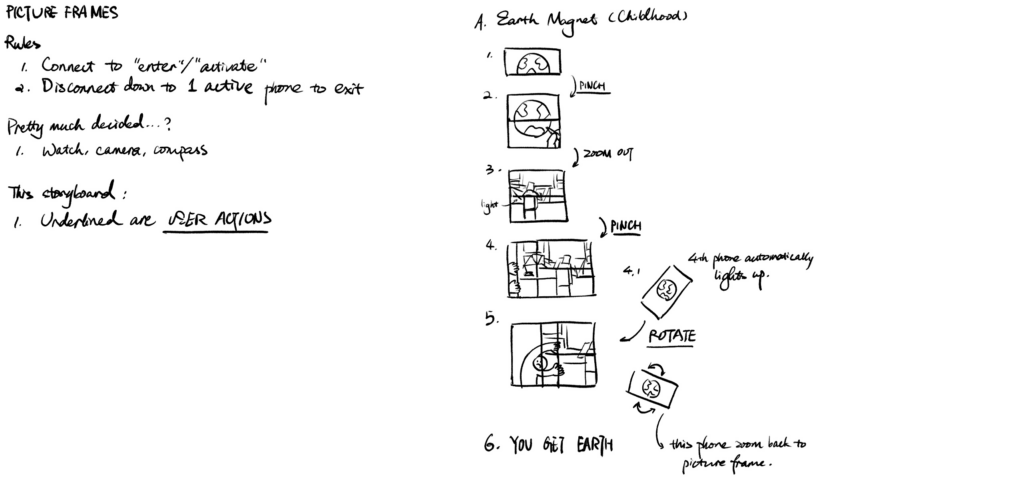
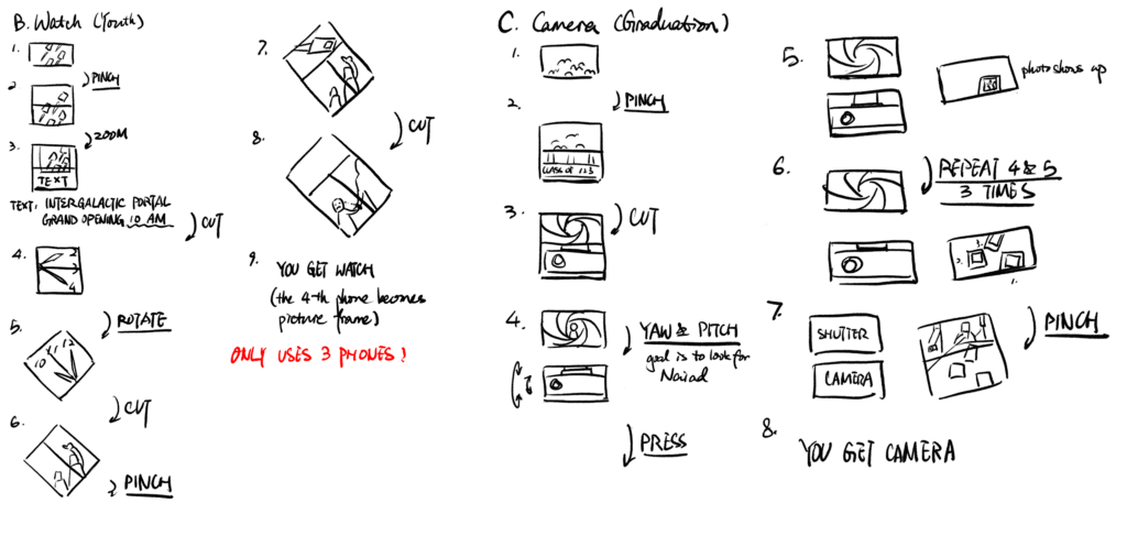
Playtest Day
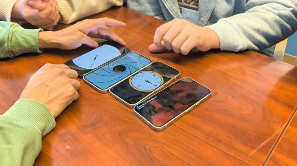
A UX fix and a Story restructure fix
What exactly is our project? The results of playtest prompted the team to rethink about the goals of the project. We knew we wanted to define a medium, and this is unfolded in two ways: functionally and meaningfully. Functionally, the medium has to find its language, the grammar, and in our case, the mechanics that are innovative. We have this in our current build, and if we wanted, we can spend the rest of our time refining the UX feels to make interactions intuitive, and start adding in story moments after the UX is good. However, meaningfully, we want our mechanics to carry the meaning, or the story, where in the player’s head, we anticipate “I am looking for the story objective” comes more importantly than “I am playing with this mechanically interesting game”. We wanted a tight narrative where embodiment of the mechanics actually tell the story. “I am turning back in time” instead of “I am turning this crank to solve this puzzle”.
What we learned from playtest was that, UX were very fixable: through composition of art assets, through hints and onboarding techniques, and through tackling every edge case we could possibly encounter. However, in terms of narrative, it has not landed tightly enough. (Though, one single playtester was able to say “I think this is a flashback” and this understanding was a huge breakthrough.

To address this, our next step of development is actually restructuring what we have for a tighter narrative, and making the crucial fixes of UX at the same time.
We’re more and more excited because our vision is coming through! Stay tuned for next weeks.