Summary
We had a public playtest session with our paper prototype on the main campus. We started building the digital version and had the modules ready for integration for playtesting with high school students next week. We designed another more advanced puzzle level (paper) with the same core concept. We also had our half sheet and poster submitted for printing.
Open Playtest
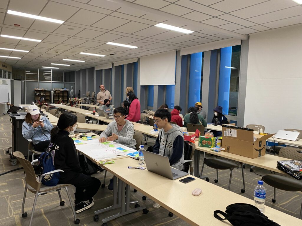
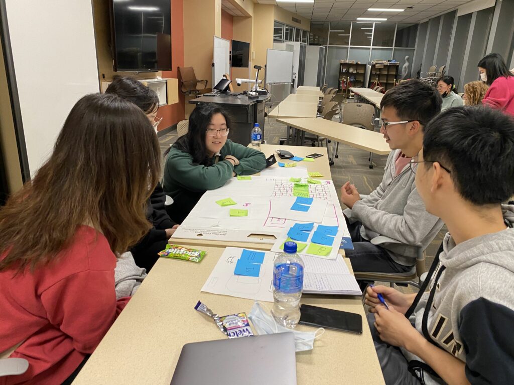
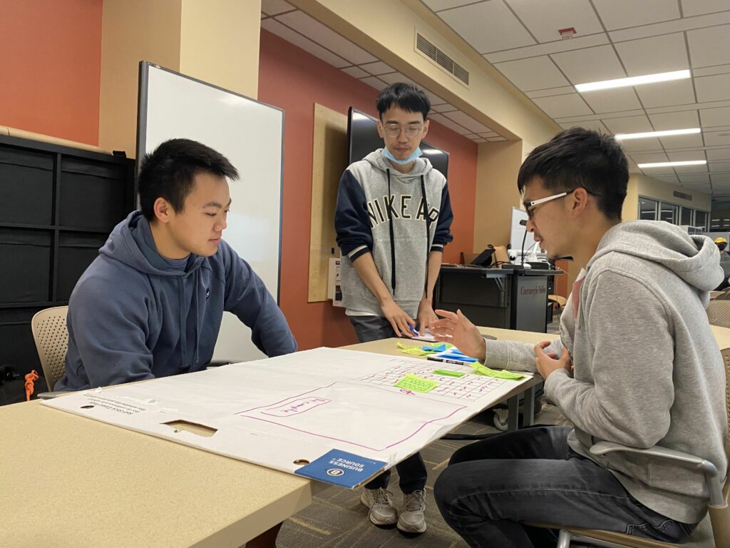
We playtested with 5 random college students of different majors on our main campus, using our paper prototype from last week. Valuable things we learned from the feedback and observations include:
- People rarely tried to pass through objects when they are visible, so they got stuck by the stone and the barrier often -> We hope a digital version will ease this problem because it’s natural to press buttons to move steps.
- When objects turned red, people perceived it as a bad sign generally.
- People got confused or even misled by the unrelated symbols we used to hide the actual property names.
- Extending the bridge was no doubt the most exciting moment for every player.
- “Blocking/Collidable” was a harder concept to understand.
- Brute force was a common strategy. People solved the puzzle even though they didn’t really understand the mechanics.
- Regardless of reversing the meaning of the symbols, the mechanics of the “statements” determining the behaviors and status of the objects were hard to understand -> We will deal with this with clearer instructions, and eventually, with tutorial levels of course.
Development
Digital Prototype
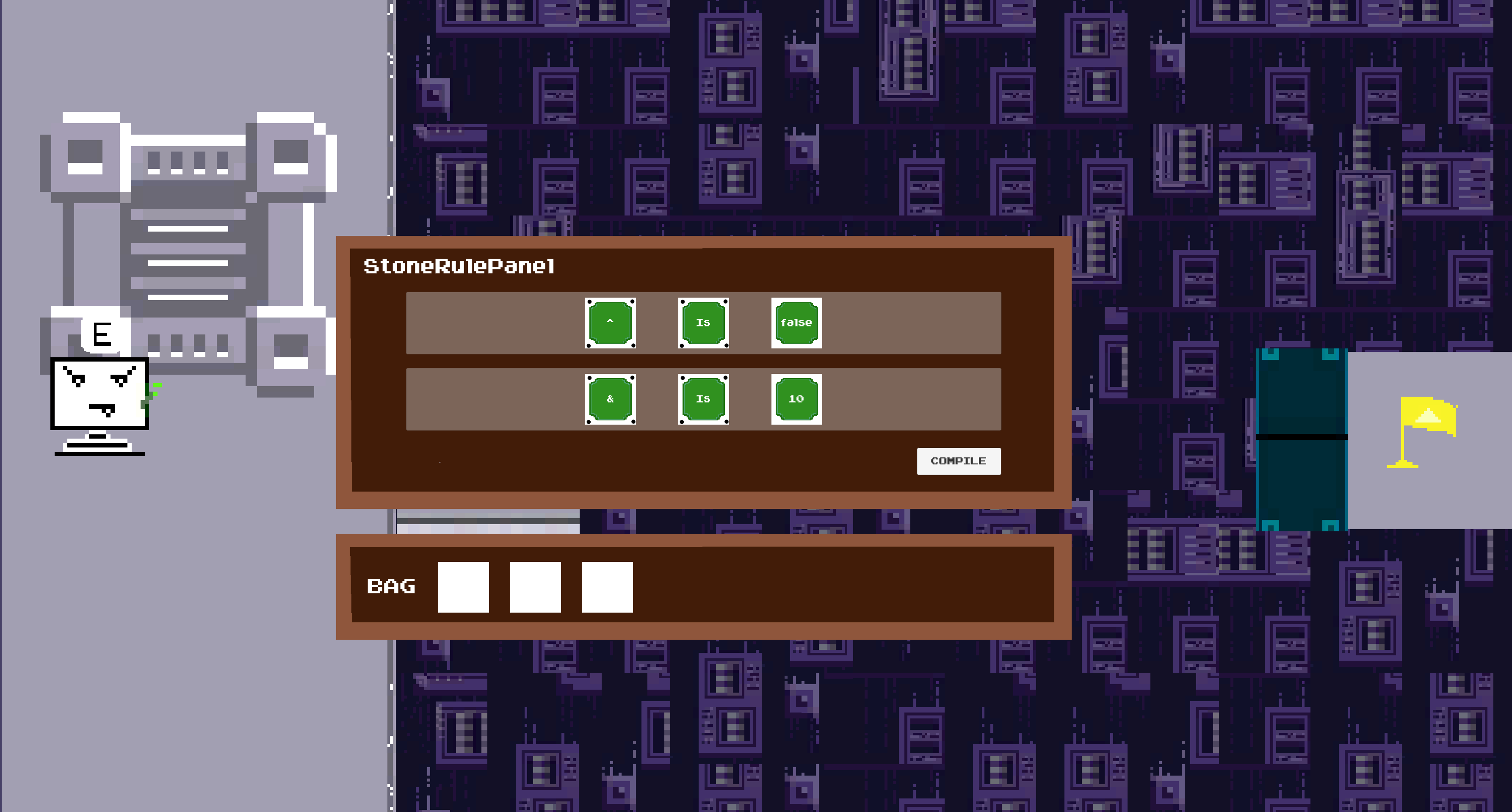
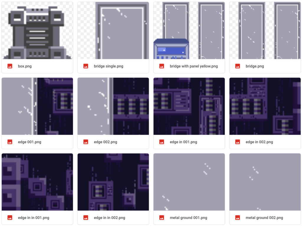
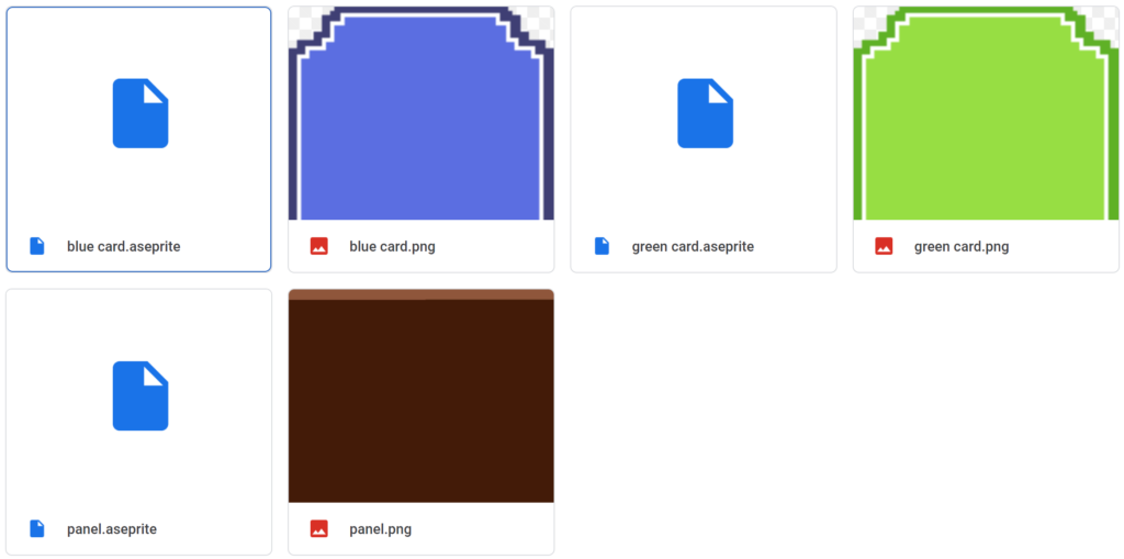
We had our first digital prototype of the same puzzle that we made on paper last week. We built it into WebGL format and deployed onto Unity’s platform, so anyone with the link can can play it in a browser. We’ll start playtesting with this digital one next week.
The goal was a rapid build for playtest purpose, so the arts and interactions are definitely going to go through a lot of polishing!
Design
More Levels
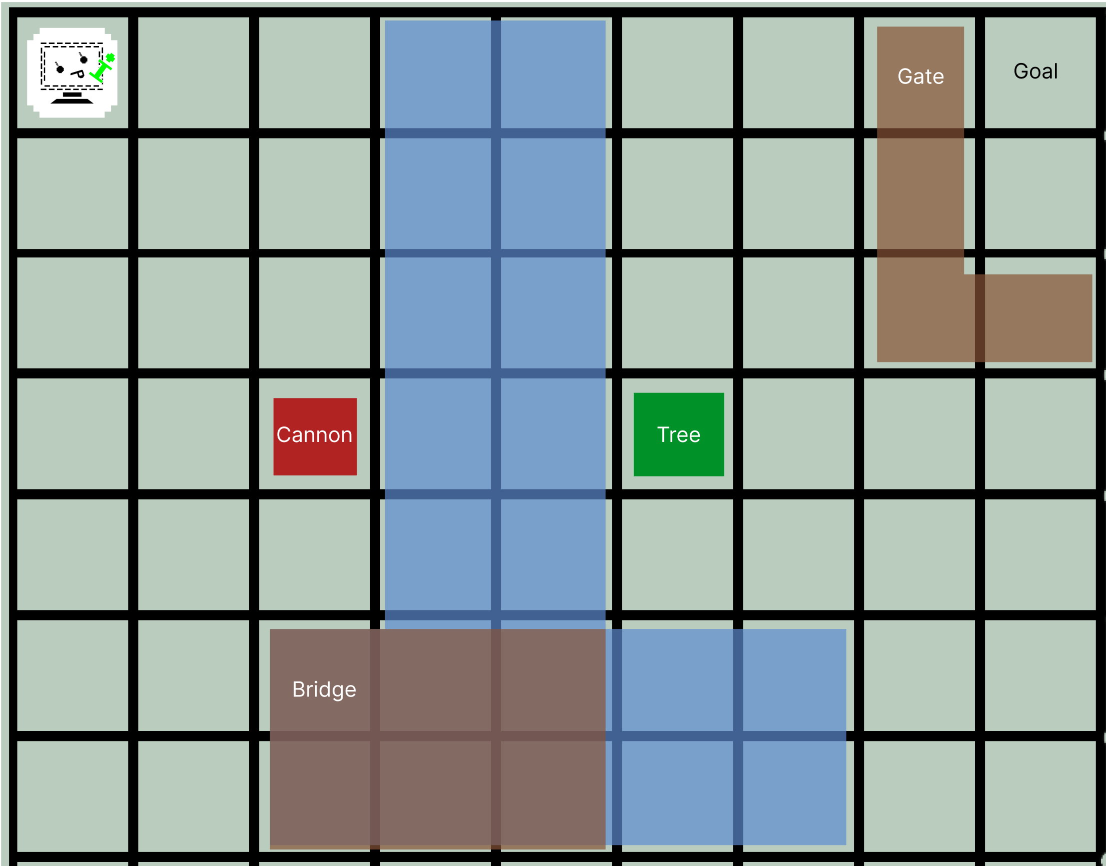
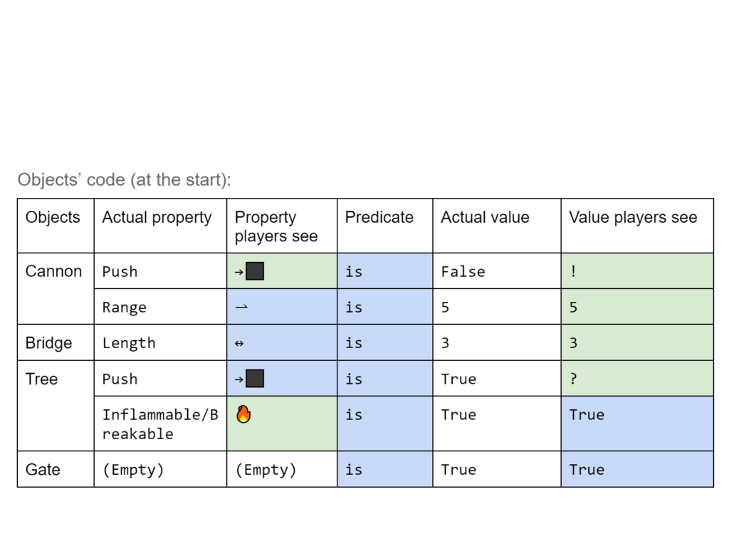
We designed the second puzzle which is more difficult but also based on the same idea of reverse engineering.
Production
Half sheet & Poster
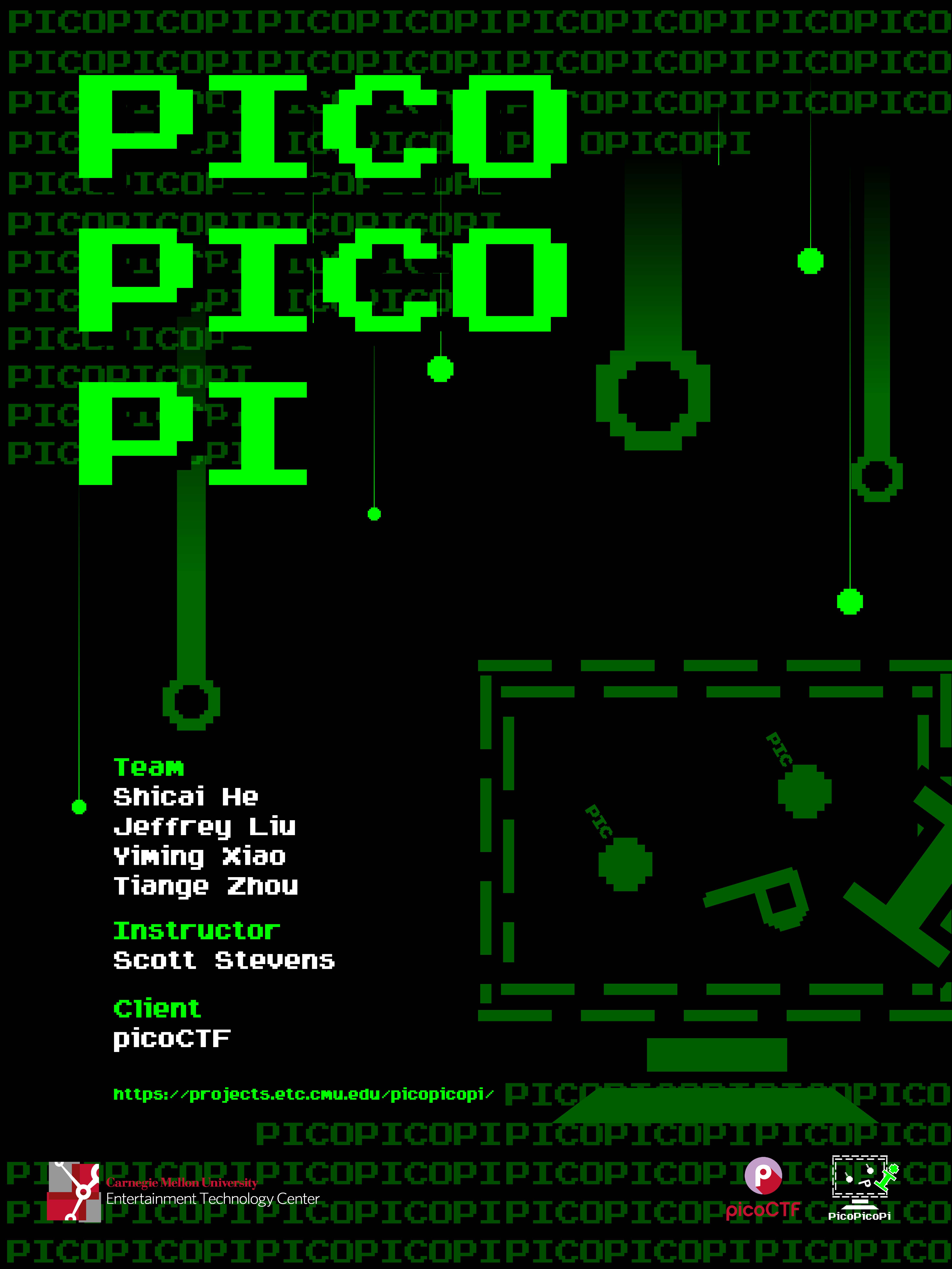
With the same geek-like and cyber theme as our logo and website, we proudly present our project poster and half sheet.
We continued using the black and green color palette that is often associated with hackers (as in Matrix). The numerous “PICOs” in the background were transformed from 0 and 1, which is how data are stored in computers. The circles dropping down with tails add a dynamic feeling to the image, implying the cyber world in our game is about to go through some significant change.
