During the previous week, we had settled on the Investment Game idea, but the idea still needed iteration and polish. Since we have only a few weeks before the end of the semester, we had to get down to business. Thus, for Week Nine, the team focused on two major points, the refinement of the game concept and the creation of a digital prototype.
Game Design
For the game design, we began Week Nine with a similar concept to what we had in Week Eight. Namely, the game would be centered around discussing which of the given technologies would be the best for solving a certain scenario. We envisioned that the players would engage in discussion with one another on the pros and cons of each technology.
However, this version of the game was ineffective in many ways. First, the game wasn’t particularly fun or interesting. Second, the discussion lacked structure and substance. Players weren’t sure what or how they should proceed. Third, the set up was still leaning too hard into the idea that there is a right answer to the question.
Thus, we had to find a way to make our game more fun and to encourage more interesting discussion amongst the players. We looked to other similar games for inspiration and amended our game design.
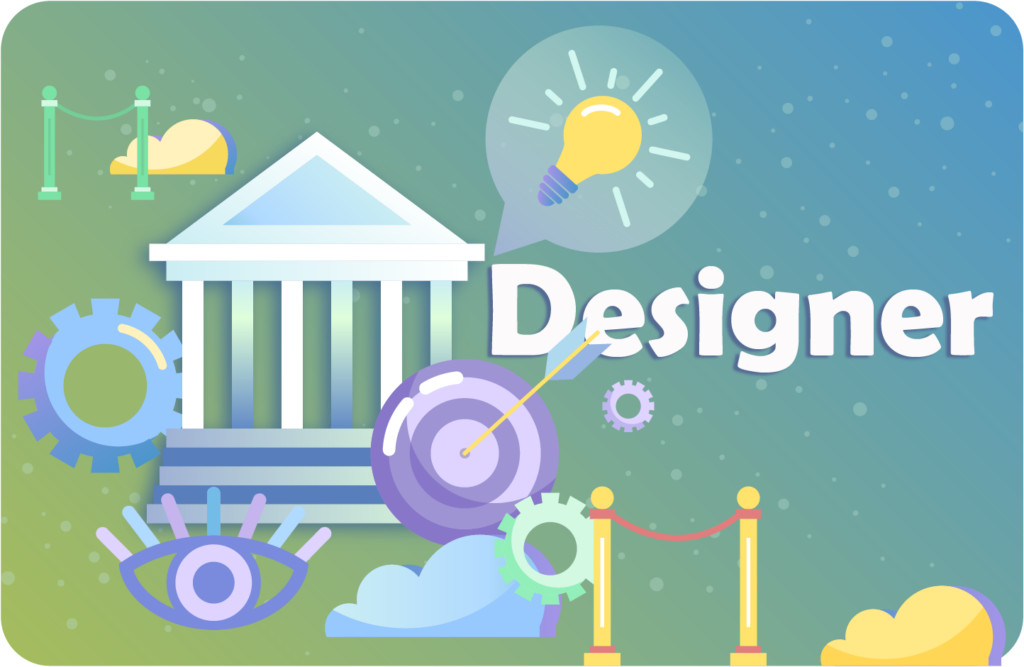
In the end, we made several dramatic changes. First, we implemented two roles, the Investor and the (Exhibit) Designers. Second, we changed the scenarios to focus less on technology specifically. These became pitch topics instead. Third, we allowed for players to come up with their own answers to the pitch topics instead of choosing from a limited list that we provided. Along with some other changes, these changes helped give our game more interest and more structure.
Furthermore, we also carried out play testing with ETC students on Thursday and Friday. From these play tests, we ended up making some modifications to our game. In response to the critique that the game was still too serious, we added some more non-serious elements. For example, what if you had to design for penguins? We also gave the Investor a secret Personal Interest. This would make the game more interesting by allowing for a reveal at the end of a round.
While we are moving in a positive direction with our game design, there is still more work ahead. We want to continue play testing and adjusting our game, especially with people who are familiar with the science engagement sector.
Current Game Design Summary
Our basic game concepts are:
- Investor: They have funding to award the Designers. They want to hear pitches on a specific topic. The Investor is also all-powerful within the game.
- Designer: They want funding from the Investor. They need to come up with ideas to pitch to the Investor based on the pitch topic.
- Pitch Card: The topic of the pitch. (Ex: Highlight women in science and technology)
- Refinement Card: A modifier for the Pitch Card. (Ex: Accessible for physically disabled individuals)
- Personal Interest Card: A secret card given to the Investor that details their personal interest. (Ex: You’re an animal lover)
Our basic game rules are:
- Choose an Investor. Everyone else is an Exhibit Designer.
- The Investor receives a random Pitch Card and a Refinement Card; and shows them to the Designers.
- The Investor receives a Personal Interest Card which they keep secret from the Designers.
- Designers pitch ideas to fulfill the Pitch and Refinement Cards.
- The Investor picks a design winner according to the Refinement and Personal Interest Cards.
- The Investor role passes to the left.
UX/UI and Art
As soon as we had a good grasp of our gameplay, we began working on creating a digital prototype. That meant that we had to determine our game’s UX (user experience) and UI (user interface). After we had a basic understanding of the UX/UI, we could then create art assets for the game.
There were several UX/UI challenges that we faced. First, how do we teach players how to play our game? Next, how do we compensate for the lack of networking? Finally, how do we present all the necessary information in a concise manner?
We created a prototype of the UI on Figma. In this prototype, we focused heavily on the Investor’s UI. As the Investor acts as a judge or host for the game, then what they see becomes the most important. On the other hand, the Designer needs far less information in order to play the game. We edited the UI several times over the week and are continuing to work on it even now.
However, once we had a basic UI, we could make art assets. We looked at our earlier art assets and used that as a starting point for the new assets. In general, our art is primarily vector-based 2D graphics which utilize bold colors and typography. We played around with using different colors to represent different pitch categories, but will likely return to a more unified style in the days to come.


Future Steps
At our Friday client meeting, we showed the game rules, the digital prototype, and the art to the ASTC. We were even able to invite our client to play one round of the game with us. In an encouraging sign, we found that our client understood the game’s rules and was able to come up with clever ideas in response to our game’s Pitch topics. Our client also seemed amenable to adding more light-hearted content to the game.
Thus, we can continue to pursue this direction moving forwards. Our first priority is fully integrating our art with our game. Additionally, we must also continue play testing. While we can continue using ETC students, the most valuable play testing will likely occur with professionals in the science engagement industry. Finally, we must use the play testing to continue pushing forward our product.

Comments are closed