On Week11, We put together everything we made, built the game on mobile devices and brought it to the “playtest night” to seek feedback.
We’ve compiled a comprehensive list of features and elements we plan to test:
- Can the postcard-sending process be smoothly completed/do players know what they are doing at each step and what to do next,
- How long each step takes
- Whether players can understand the narrative (asking them to retell it)
- Interface functionality/readability/font size/paragraph length
- UI functionality of the last few pages of the postcard sending process
- Incorporating narrative text into the UI
- Replacing this version’s UI assets
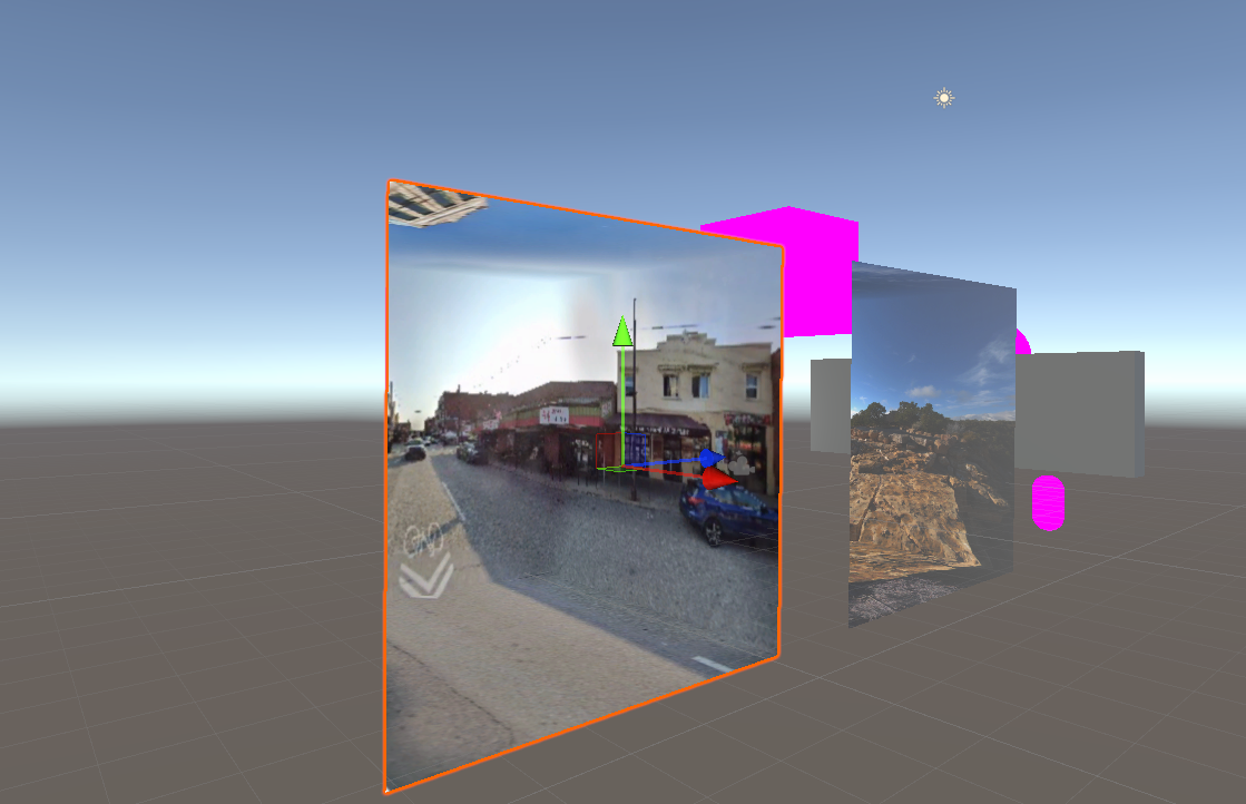
- Scanned file entering the scene + testing the stability of real-world scanning
- The display effect of models
- The effect of the postcard shader
- Whether players will skip choosing stamps/custom text and the order of customizing text and stamps on the second postcard
- Whether players can understand the connection between the three postcard images (if a 3D effect of the postcard images is implemented, whether players will focus more on the effect,
- Whether players can understand the similarities and differences between the postcards in the game and real postcards
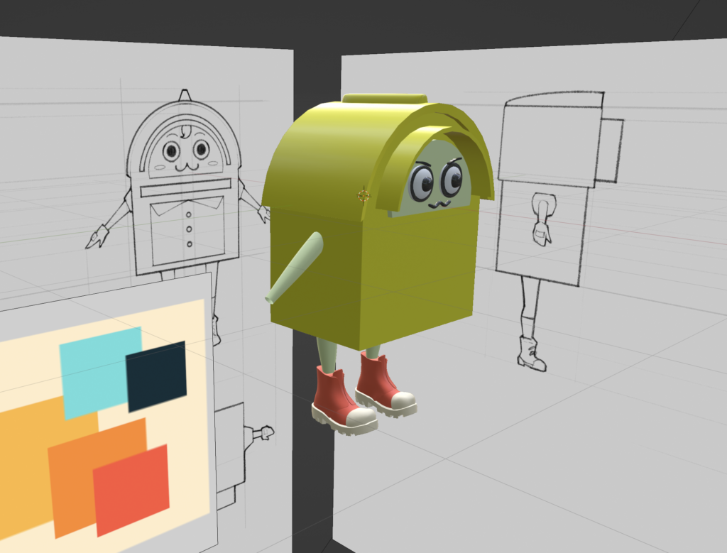
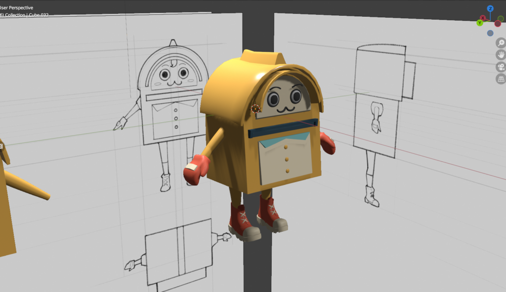
- First impression of the mascot & impression after playing
- Any moments during the process that start to feel boring
- Whether the options for replying are reasonable, and if not, whether there’s a desire to add, remove, or change options.
Playtest
Here are some of the playtest results:
- Guests don’t understand what they are doing each step.
- Guests don’t know the purpose of the postcrossing gameplay.
- Guests don’t know the difference between the 3 postcards.
- Guests like the tilting interaction of the postcard with 3D scene.
- Guests get our main idea of cultural integration from the narrative.
Thus, we made several plans to iterate on the questions and set up some goals for the next playtest (Apr6). Some of the plans are as follow:
- Add onboarding page using illustration to introduce the context and gameplay.
- Add tutorials on each step to give specific guidance.
- Change the color and background of the 3 postcards to make them look different.
User Interface (UI):
The UI team has been exploring various styles and has decided to experiment with a design inspired by the visually striking game, Persona 5. This approach aims to marry aesthetics with functionality, enhancing the overall user experience.
- Made the visual concept that uses the paper-style elements that suit the postcard topic.
- Made 2D assets and put them into the engine.
Animation
- Kept making the character animation including appearing, idle and catching the second postcard.


We would say this week is very productive! Stay tuned for more updates from Voxalburgh and see y’all next week!

