Based on the takeaways from the 1st playtest, the design team started to create the first version of the prototype to do more playtests for the implementation after halves.
Design principles
Our design approach for the first high-fi prototype focused on two key aspects:
- Testing the visual style’s ability to connect people to the ETC culture and assessing the viability of the visual components in the kiosk.
- The use of black and orange colors conveys a futuristic technology vibe, reflecting ETC’s cutting-edge approach.
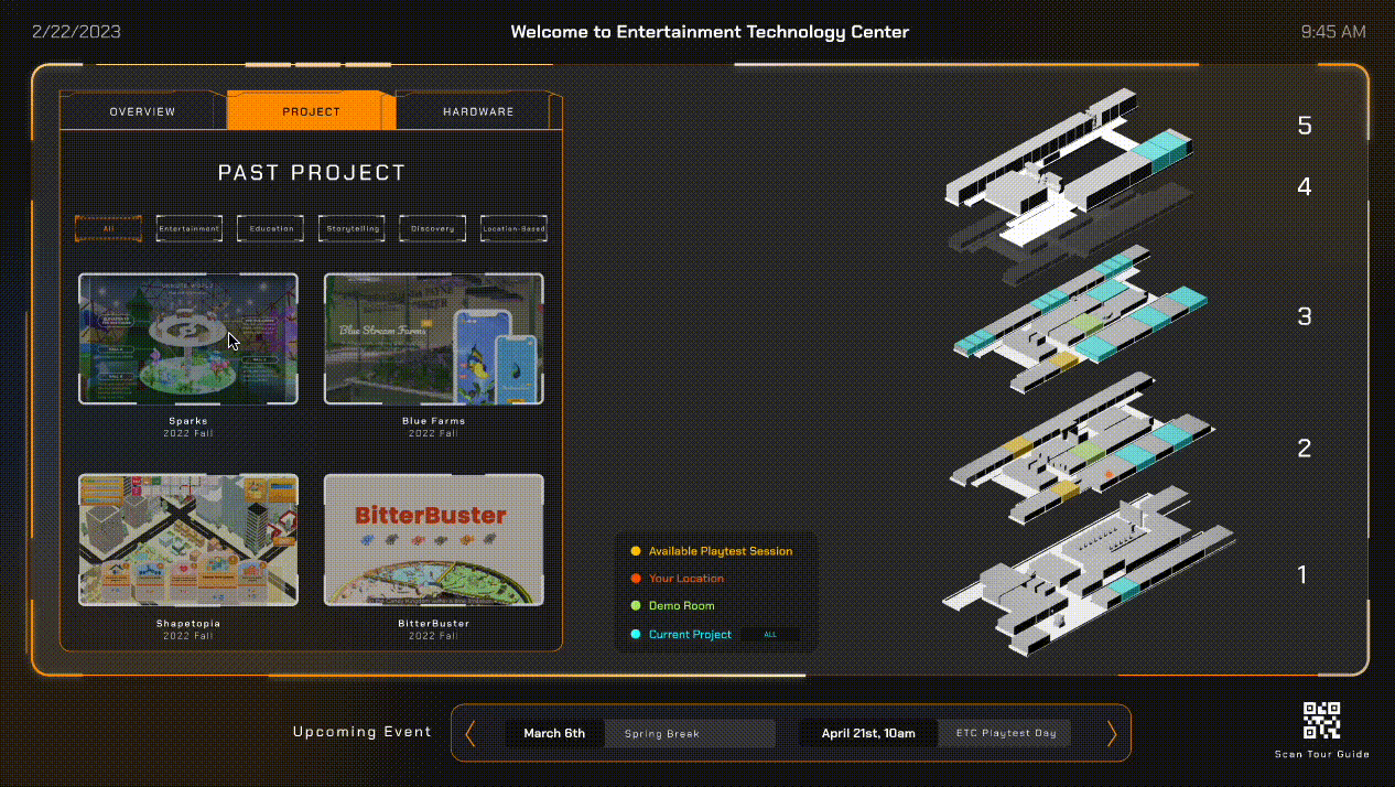
To organize the information in the kiosk, we divided it into two parts:
Left side: an information panel showing text info about project, hardwares and ETC info
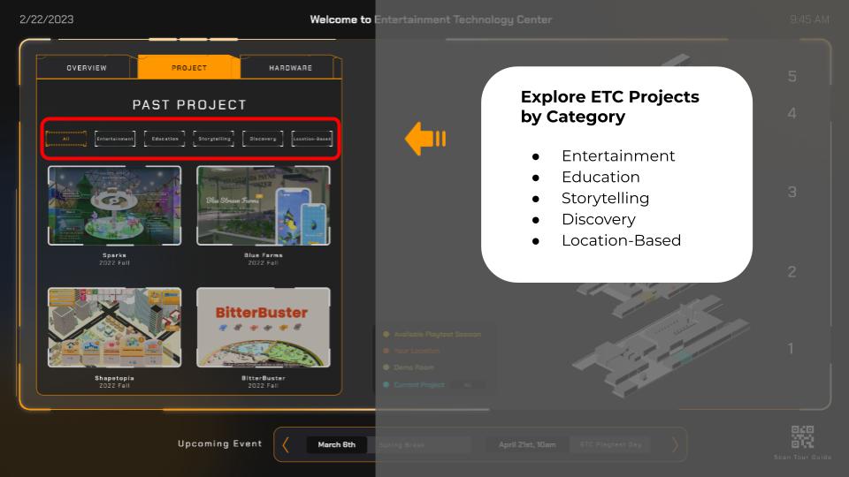
Right side: a 3D model with color codes representing different rooms
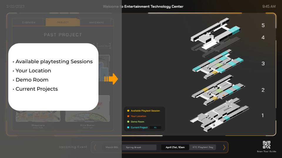
These two sides are interconnected, enabling users to interact with the kiosk in a more intuitive way. For example, clicking on a button on the right side can trigger changes in the appearance of the 3D model.
Our goal with this design was to create an engaging and immersive experience for users that would reflect ETC’s innovative spirit. We believe that our design approach will help us achieve that goal and provide valuable insights for further iterations.
Second playtest
Playtest Participants: CMU students and ETC faculties
Goal: The goal of the second playtest was to evaluate if the visual style, components, and layout of the interface helped users gain a better understanding of ETC’s work.
Feedback:
- 10/10 participants enjoyed interacting with the 3D model
- 5/10 participants expressed frustration with the difficulty of finding connections between the right and left sides of the interface
- 6/10 participants requested that all buttons be implemented to demonstrate full functionality since it was only a Figma prototype