Organized and Documented by Qiwen Lei

About: Mobile AR application design / UIUX design / Logo design
Timeline: Jan 2023 – May 2023
Tools Used: Figma, Illustrator, Photoshop, Procreate
Design
Ideation
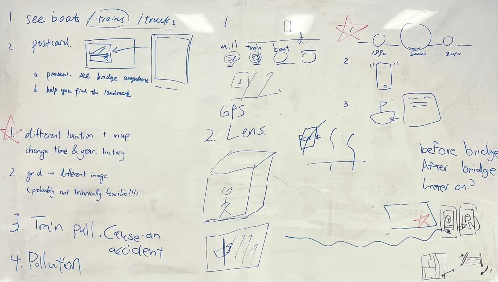
After analyzing our research findings and generating potential design concepts through brainstorming, our team convened to initiate early-stage ideation. We organized our ideas into the following categories:
- Mobile AR
- Camera interaction
- Post-processing
- Postcard design
- Mobile games
- Audio podcasts
- GPS-based location services
- Other digital mediums
Key Features
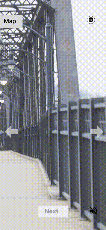
Mobile AR Experience: Our mobile AR experience will enable users to easily move between different locations and view virtual and real objects simultaneously on one screen. This feature will create a seamless and immersive experience for users.
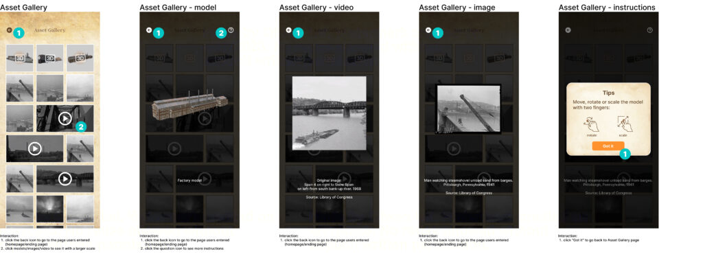
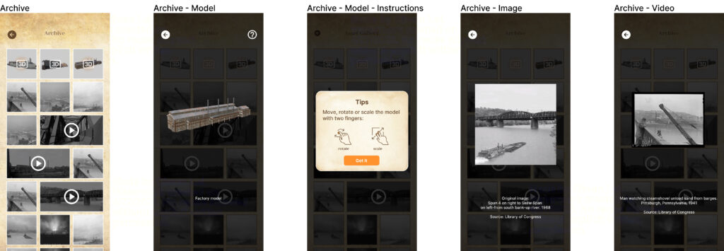
Assets gallery: The assets gallery will display all the images, videos, and models included in the experience, allowing users to zoom in and gain more information. This feature will provide users with a deeper understanding and appreciation of the historical context behind the assets.
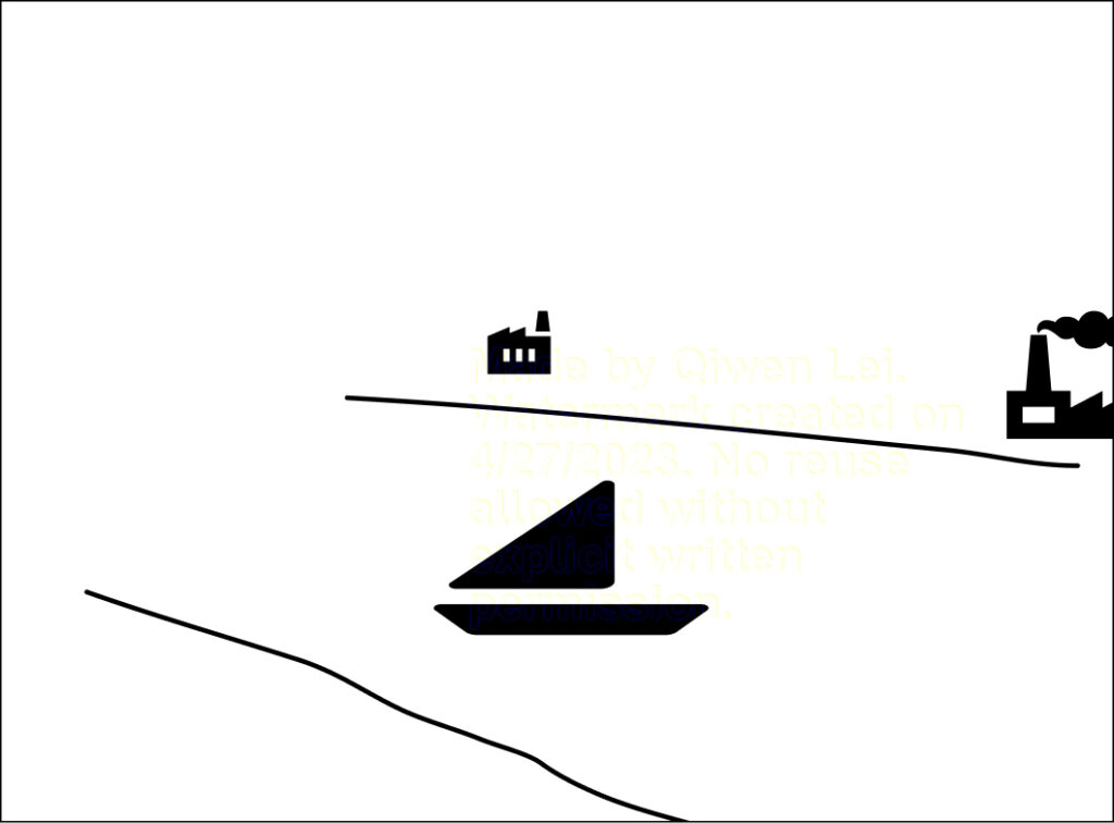
Bridging Time: By juxtaposing old and modern architecture, users can visually compare and bridge the history of Pittsburgh across time periods. This feature will provide users with a deeper understanding and appreciation of the evolution of Pittsburgh’s architecture over time.
3D modeling of old architecture: Using historical references, we plan to build 3D models of nearby historic buildings. Users will be able to view the models from various angles, either by rotating the model on their phone or by physically walking around to explore the virtual architecture in a more immersive way.
Location-based guidance: With the use of a map, users will be directed to various locations on or near the Hot Metal bridge. Upon arrival at each location, users will have the opportunity to view the surrounding area as it looked and read a short history of the era through their phone.
Essential time period: By focusing on one key time period that best represents the history of metal in Pittsburgh, users will have the opportunity to gain a deeper understanding of this important historical era.
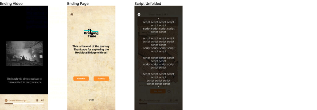
Linear storytelling: The app will feature a linear storytelling approach, which will enable users to fully immerse themselves in the story and connect with the historical events being portrayed.
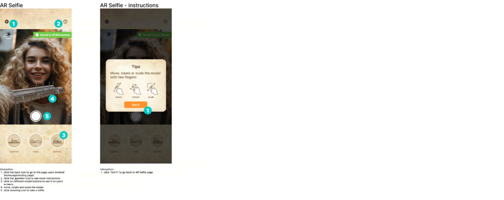
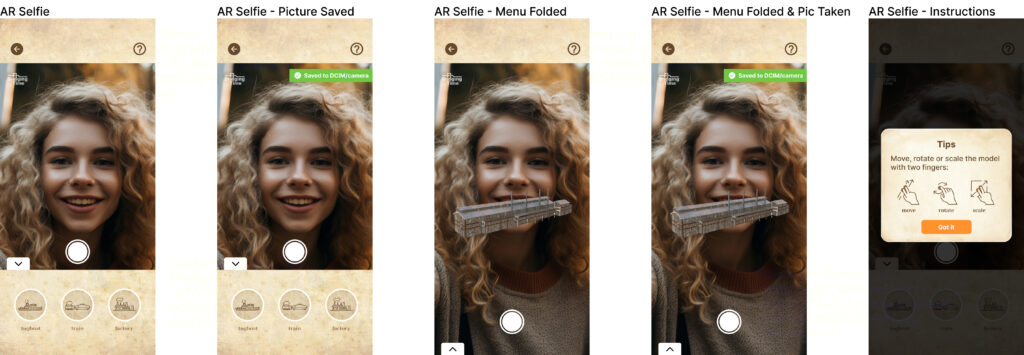
AR Selfie: This feature will enable users to take selfies with the 3D models appearing in the app, adding a fun element to the overall experience.
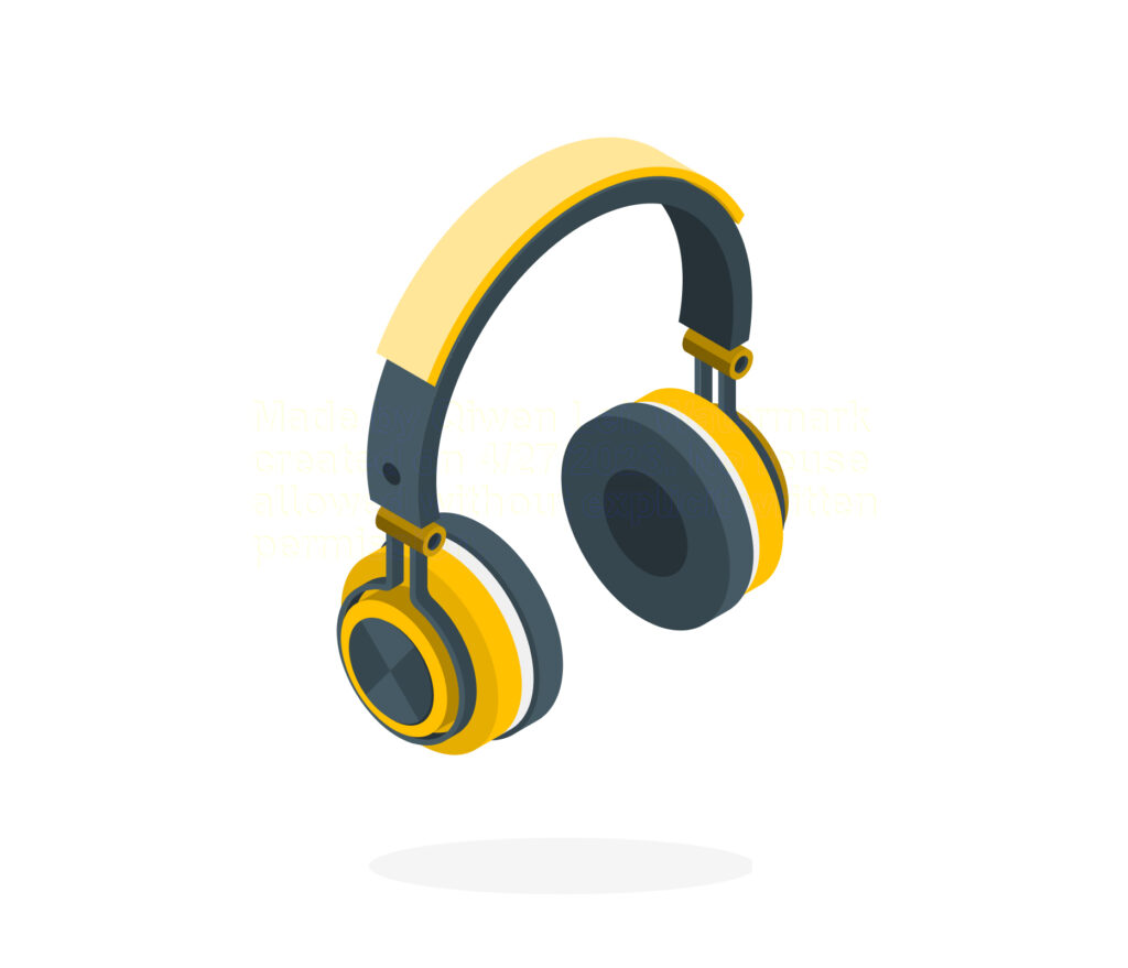
Audio support: To enhance the user experience and prevent accidents while using the app, audio will be played during the experience. This will also allow individuals with reading disabilities to participate in our experience.
Wireframe
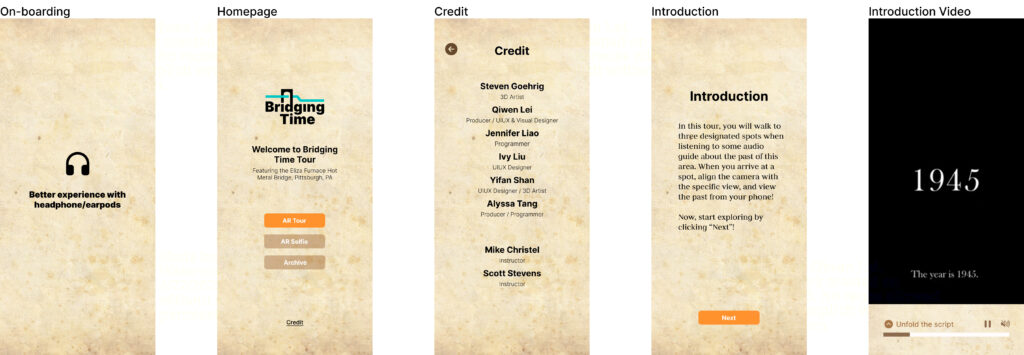
To create an engaging and seamless app experience, we begin by developing a wireframe consisting of three key sections: onboarding, the main experience, and off-boarding.
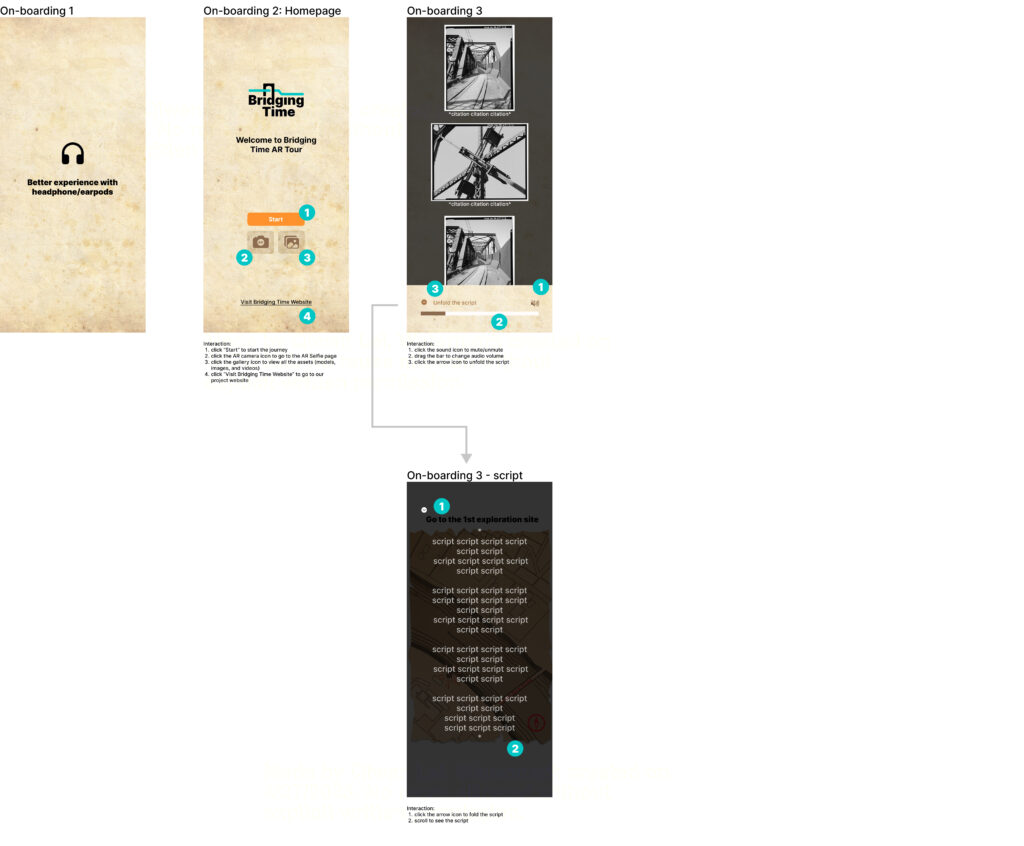
Onboarding
During the onboarding phase, users will get a sense of what the app is all about and will be provided with basic instructions on how to use it.
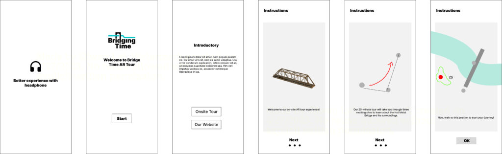
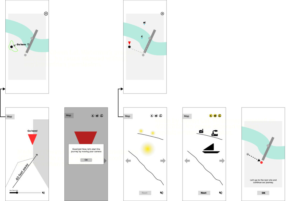
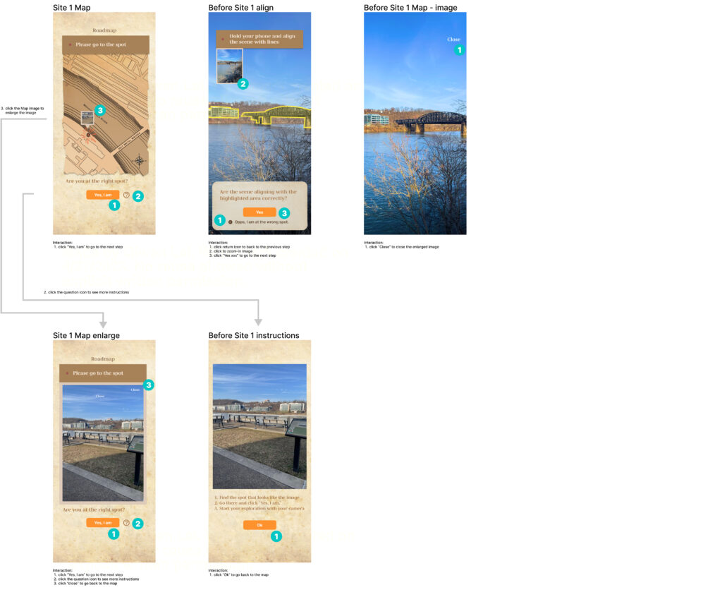
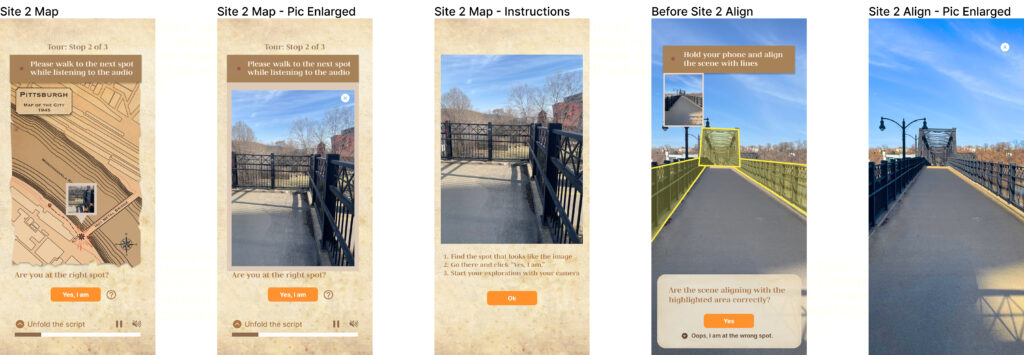
During the tour – Site 1
The main experience involves using the map to guide users to Site 1, the starting point of their adventure. Upon arrival, instructions will prompt users to activate their camera and look around, where they’ll find one to three models waiting to be discovered. Once all the models have been found in Site 1, users will be directed to Site 2, and the process will repeat. Audio guidance will be provided throughout the experience, offering historical information about Pittsburgh and the Hot Metal Bridge.
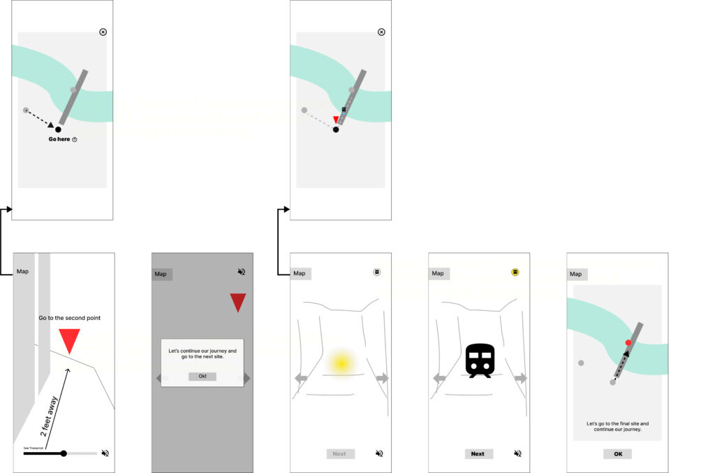
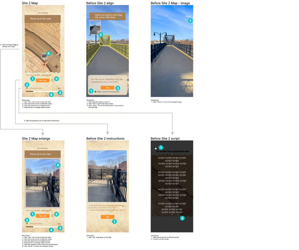
During the tour – Site 2
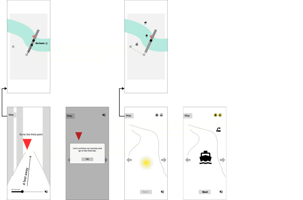
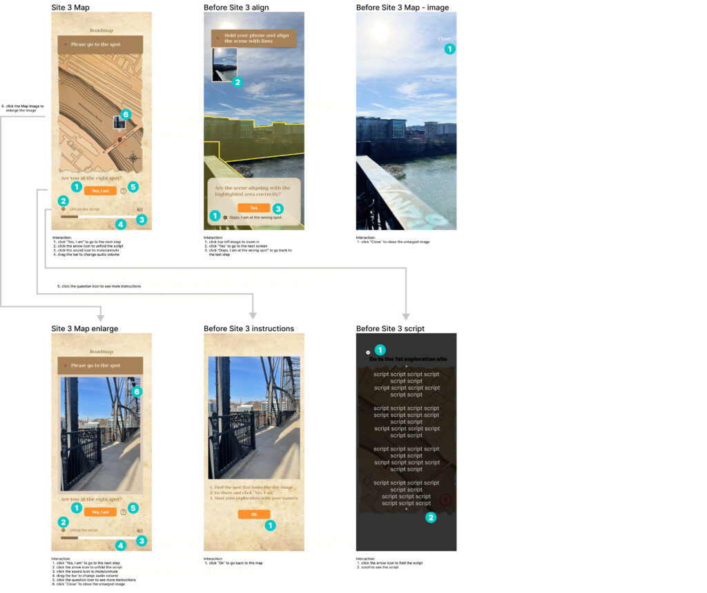
During the tour – Site 3
Off-boarding
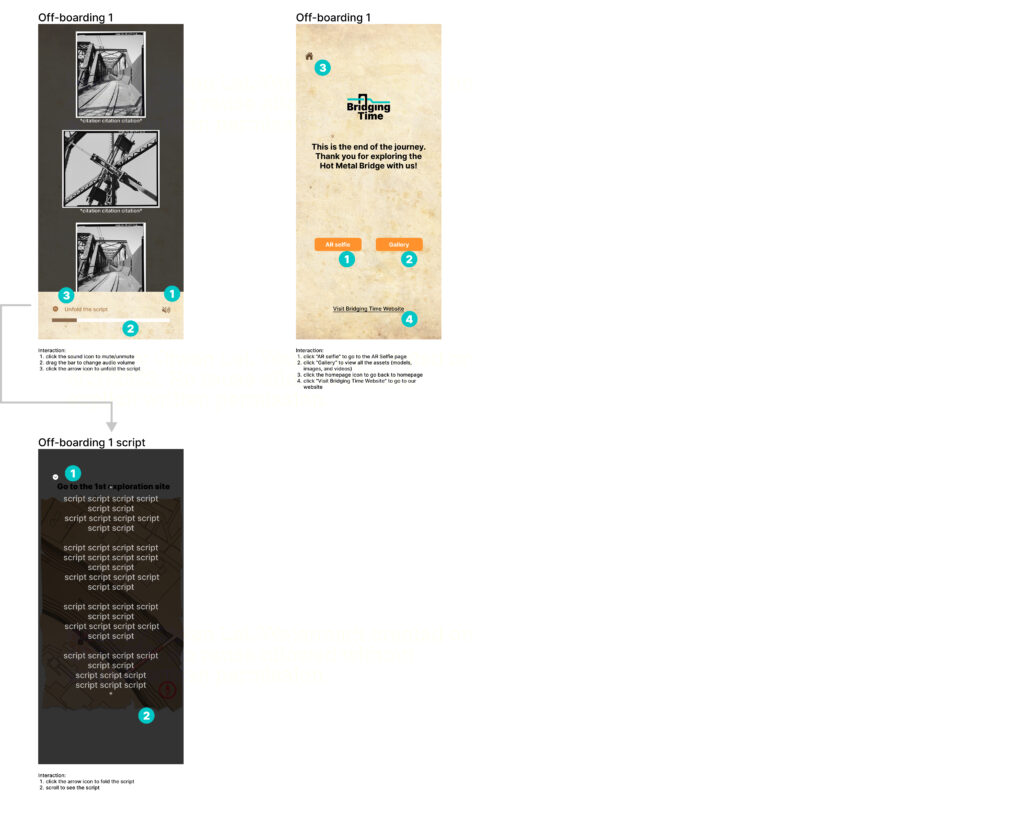
After discovering all the models in each site, users will be directed to the ending page, which features additional information and options to guide them back to the app’s homepage or Bridging Time website.

Major Interaction Design
Option 1:
To highlight the 3D model, we added a bright lightning ball that users can click on. Its vivid color attracts user attention and makes it easy to identify as the button to reveal the model.
Option 2:
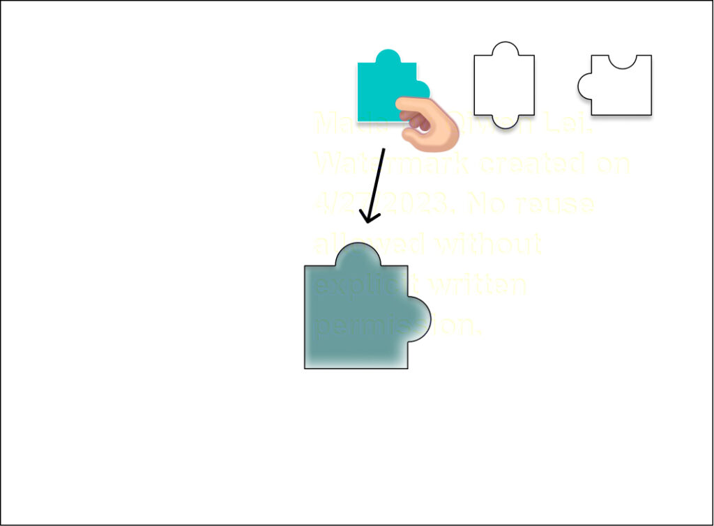
By dragging the puzzle pieces in place, the model will be revealed. We were expecting the change to make the overall experience more engaging and exciting for our users. Click to experience its interaction prototype.
Option 3:
Upon entering the scene, all virtual models will be simultaneously displayed, requiring users to manually rotate their camera to locate each model within the scene.
User Testing and Takeaway
To ensure our design aligns with user needs, we conducted playtesting with individuals ranging from 20 to 55+ years old from the Carnegie Mellon University Entertainment Technology Center. Based on their feedback, we made the following changes:
To avoid overwhelming users with too many instructions at the beginning, we replaced text-heavy onboarding with more illustrations and incorporated the instructions into the experience.
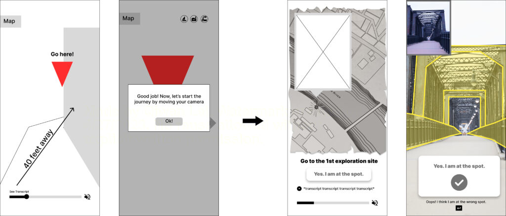
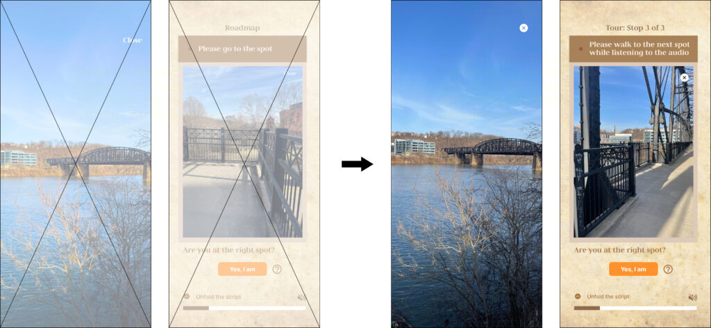
To enhance the accuracy of users’ location and viewing angle during the tour, instead of using GPS, users will be guided by a full-screen map and then use their cameras to align an on-screen outline of the architecture with their actual surroundings. To help with this process, we will provide a reference image on the side of the screen that can be zoomed in by clicking. This will indicate the direction and location of each site, ensuring users have clear direction and orientation information at all times.
During the user testing on our three options for the major interaction design, we observed that presenting all the models in one single pop-up at the same time resulted in users sometimes missing one or two models that were placed off-screen when they first entered the scene. Additionally, we determined that the light balls idea needed to align better with the app’s overall style. Given the technical challenge of aligning a 2-dimensional puzzle piece with a blank square shape set in the 3-dimensional world, we made the decision to place the model into virtual treasure boxes. Users will be required to locate these treasure boxes by moving their cameras and clicking on them to view each model, creating an engaging and interactive experience for the user.
During the user testing on our three options for the major interaction design, we observed that presenting all the models in one single pop-up at the same time resulted in users sometimes missing one or two models that were placed off-screen when they first entered the scene. Additionally, we determined that the light balls idea needed to align better with the app’s overall style. Given the technical challenge of aligning a 2-dimensional puzzle piece with a blank square shape set in the 3-dimensional world, we made the decision to place the model into virtual treasure boxes. Users will be required to locate these treasure boxes by moving their cameras and clicking on them to view each model, creating an engaging and interactive experience for the user.
Iterated Prototype
Building upon the valuable insights gained from our extensive playtesting and design iterations, we have now reached the stage of finalizing our interface and interaction system. With careful consideration of user feedback and a deep understanding of user needs, we have crafted an intuitive and user-friendly interface that will provide a seamless experience for our users. Under each page, the corresponding interaction are listed.
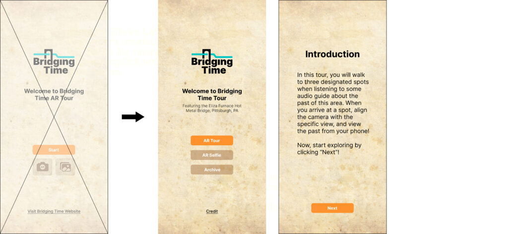
Onboarding
AR Selfie
Asset Gallery
Site 1 — Site 2 — Site 3
Off-boarding
Playtest & Iteration
Based on our playtest results, we discovered that using words rather than icons is more effective in helping users understand the functionality of each feature. Therefore, we replaced the icons for “AR Selfie” and “Archive” on the homepage with text buttons.
To enhance the user experience, we added an introduction page prior to the main experience. This page offers a brief overview of the software and sets expectations for the upcoming experience, enabling users to quickly understand the software and navigate through the application.
We modified the link located under the homepage to a credit page instead of a web link.
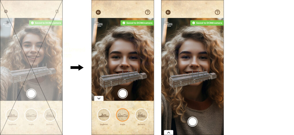
we received feedback from our instructors that the menu of the 3 buttons was obscuring important information for users. To address this, we added an unfold function to the menu on the Selfie page. This change allows users to fold the menu to preview their selfie picture and see what the camera view looks like. We believe this will make the app easier and more intuitive to use.
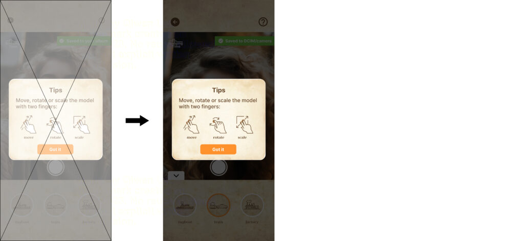
After receiving valuable feedback on race and skin-tone sensitivity, we decided to redraw the hands in the illustrations and changed the color to a transparent hue to avoid any unintended associations or implications related to race or skin tone. We believe this change promotes inclusivity and respects diversity, and we are committed to continuing to improve our designs with these values in mind.
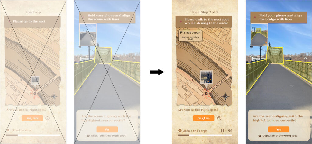
We have added an indication of the year shown on the map on every page that guides users to the next spot. This will provide users with a clearer understanding of the time period of Pittsburgh they are experiencing.
Additionally, we have made changes to the interface to provide clearer guidance to users. We have increased the size of the preview image and added a zoom-in icon to signal to users that the image can be interacted with. We have also utilized more straightforward text guidance to ensure users understand what they need to do, making the platform more intuitive and user-friendly. These enhancements are aimed at making the user experience more enjoyable and effective.
We replaced some of the simpler and more straightforward text on the page with intuitive icons. This change helps to streamline the user interface, making it more efficient and easy to navigate.
Finally, we have ensured consistency throughout the experience by unifying the icon size across all pages. These changes are aimed at enhancing the user experience and making it more user-friendly, helping users to quickly understand the page and effectively complete their desired actions.
Final Interface Design 🎉
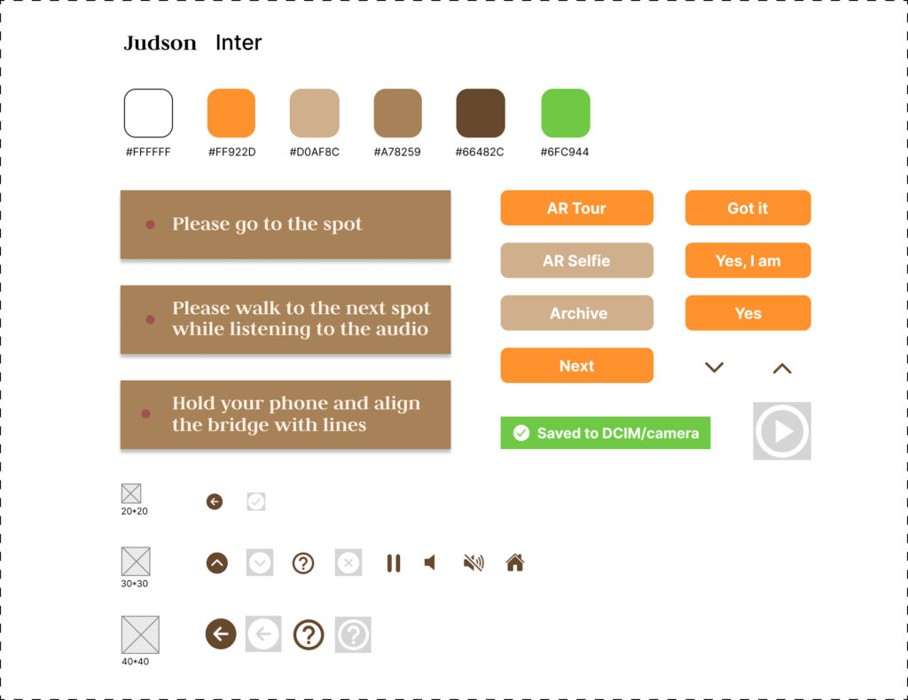
Design System
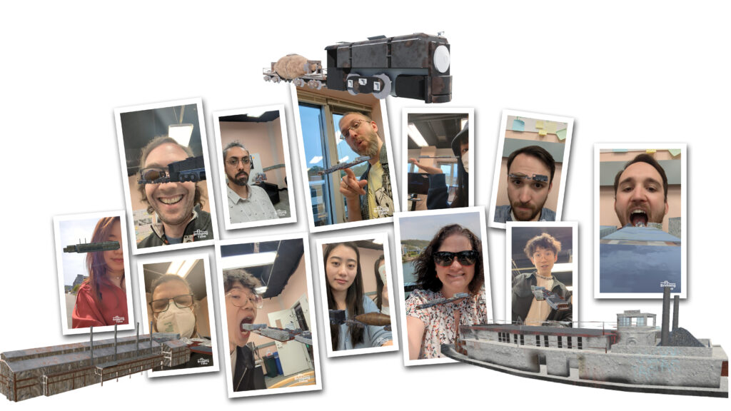
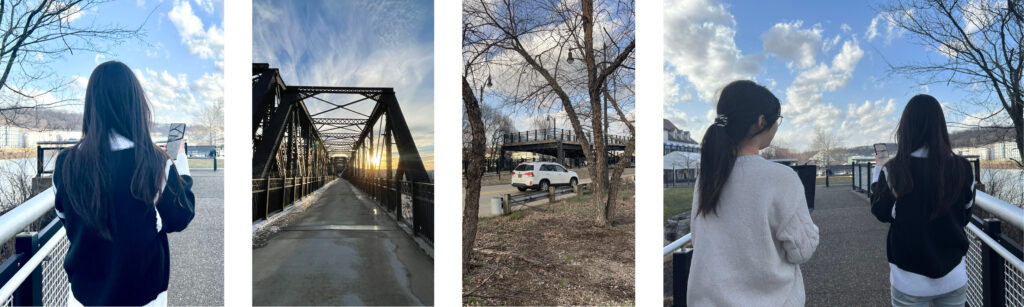
Users’ selfies by using our Bridging Time AR app