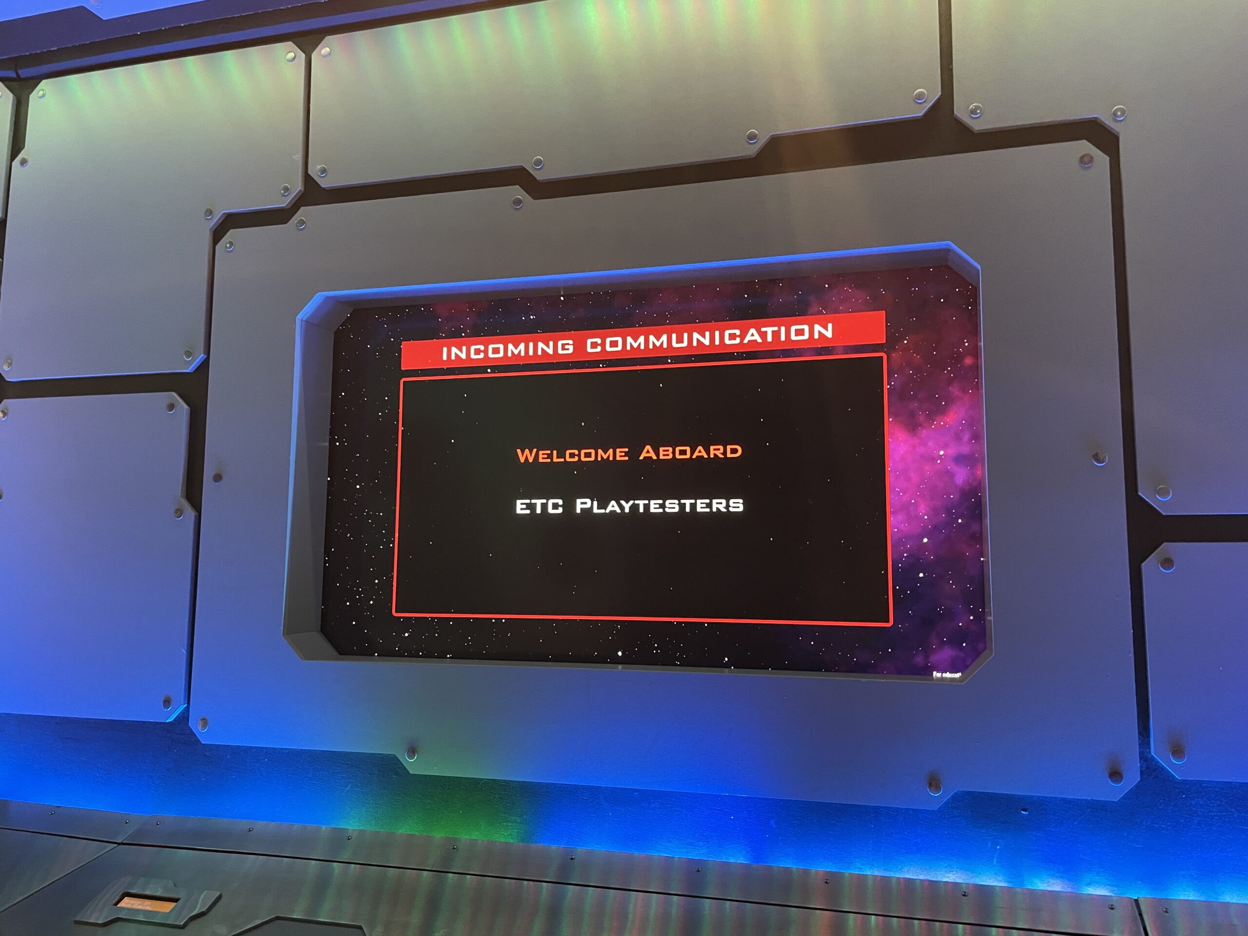
For week 10, we improve a lot with every function system, 3D assets, and UI interface. It is finally our big time to be playtested by the ETC playtest team, which contains variable age groups like teenagers and adults. Based on the the questionnaire that PlayTester filled out and observation, we organized some major problems and think about some possible solutions. We also find some SFX for drawing cards, playing cards and building generate etc. Also, background music is relaxing and chilling with the city ambient sound effect.
Programmer
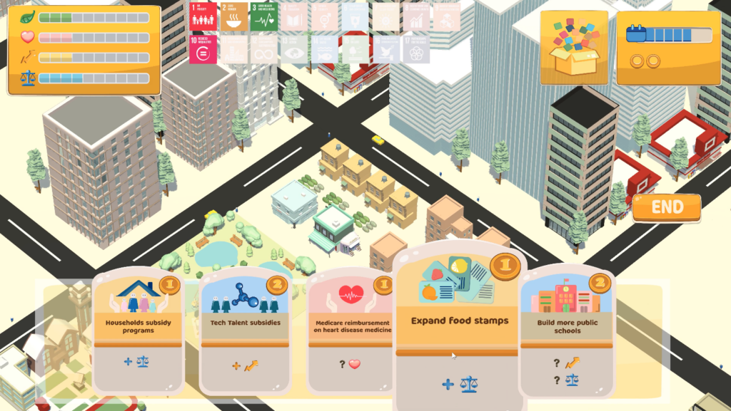
Our programmers kept utilizing the game mechanics within the gameplay. The city generator can now produce a reasonable amount of tall buildings and regular houses into the virtual environment. At the same time, unique buildings will be generated only when the related policy cards are played. We are planning to add a map to show the entire top view of the city.
Also, we are adjusting card hierarchy and some minor bugs. We plan to fix the glitching of the cards when testers hover on the edge of each card. For the dynamic motions of citizens and vehicles, we added AI to both car models and citizen models so that they won’t run into each other in a pre-planned routine. For the collection system, we will add a description page(click the card to see the one-sentence description and related goals).
UI/UX
Artists designed a dynamic UI for both the tutorial scenes and the interview scenes so that the game will be more vivid. We also finalized the dynamic start page in after effect and AI and upgraded some details of the game(including hyphen of the text, assets.
We also designed a survey for playtest research in order to gather more specific feedback for game polishment.
Playtest conclusion
The goal of the playtest is to find problem to improve the game experience and to see if our game achieves clients’ need.
Survey
From the survey that playtester filled out, we pay more attention on the impact of SDGS on players during the game experience.
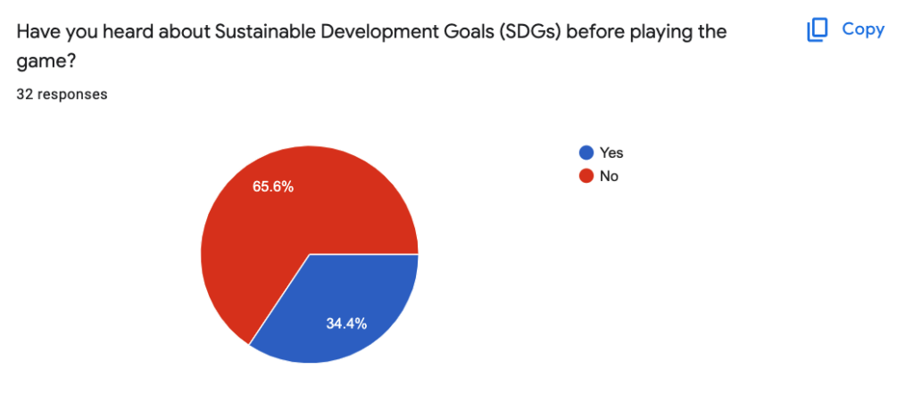
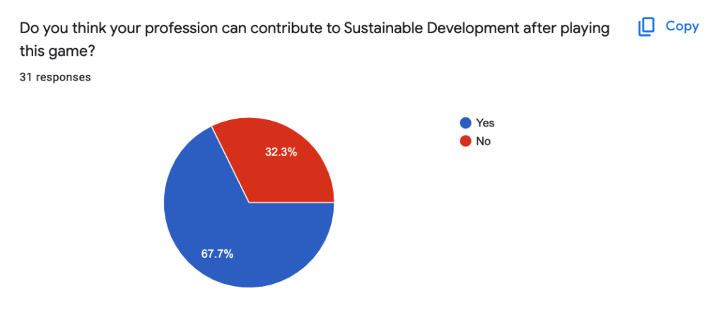
- Most of them have a clear understanding of SDGS after this game experience
- Some of them found more connections between their life and SDGS
Observation
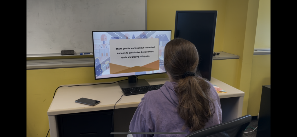
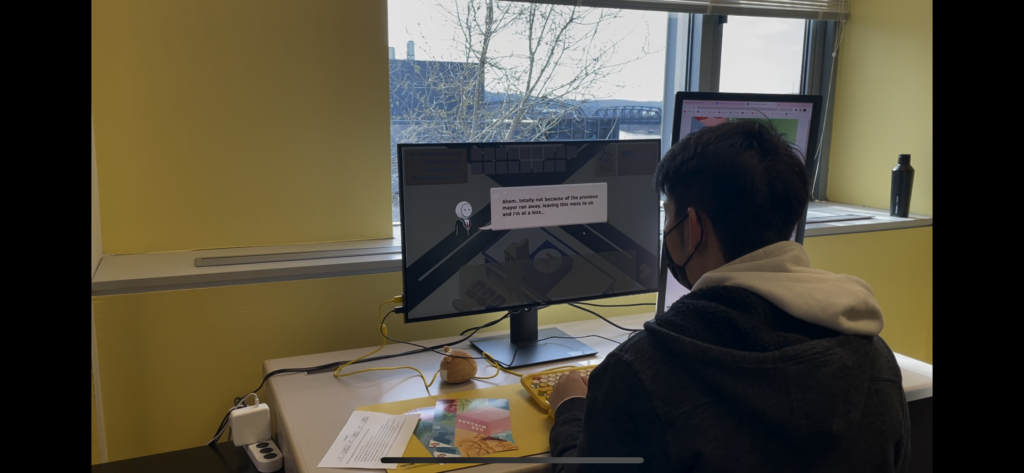
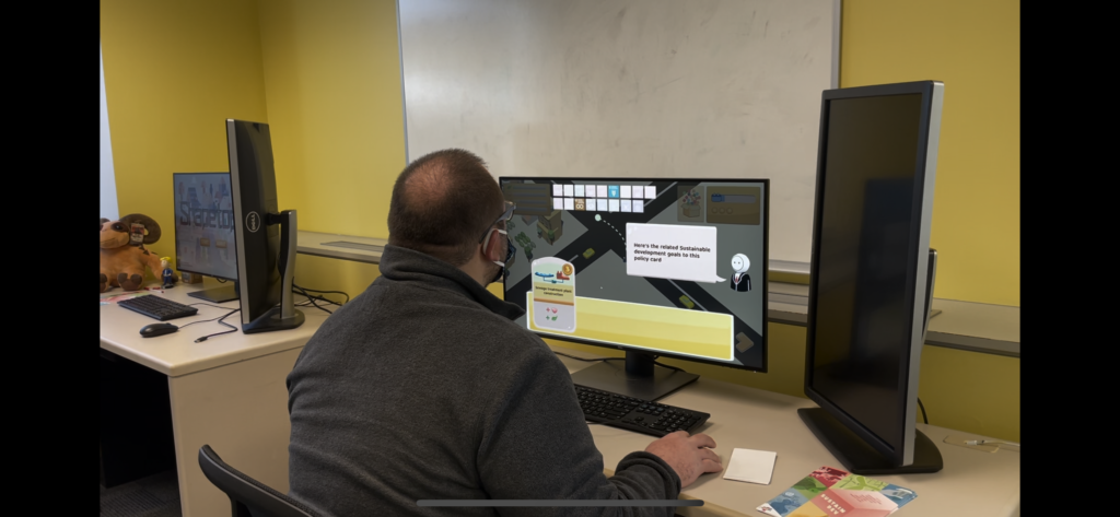
For our observation, we discover some critical problems:
- Interface UI is easily neglected: Budgets, Collection, Card within the collection, descriptions with long words, and even the “END” button.
- Some of the testers are eager to hover on SDGs on the top of the screen, while others did not pay attention to them.
- Tutorial is too long for a short gameplay.
- The zero cost UI confused a lot of testers.
On the other hand, some tester are having interested action on our games, which is not our original design:
- Testers overthink the negative effect of our cards’ policies.
- Testers try to interact with every UI on the screen.
- Testers want to check out their scores and interact on the end page.
- Testers are enjoying exploring the city.
Conclusion
These observations are very important for the future polishing process. Although the final result is that most of the testers are enjoying the game and considered it as a fun game, there are some major issues we need to address:
1. We need to integrate the SDGs into the gameplay more completely than before.
2. They want to get more feedback after they place any policy cards.
3. Most of the testers are losing focus when there are too many words and information in the game.
Future Plan
Week 11
- When hover on the SDGs, the introduction of specific goal shows up. (1)
- if there are no budget/coins left this round, the icons of the coins will become gray. (2)
- Add more visual feedback of the city when player play a card. (2)
- Turn down the probability of random events (3)
- Get rid of the turns indicators and show current turn at the beginning of every turn (3)
- Simply the tutorial/ replace some words with visual language (3)
